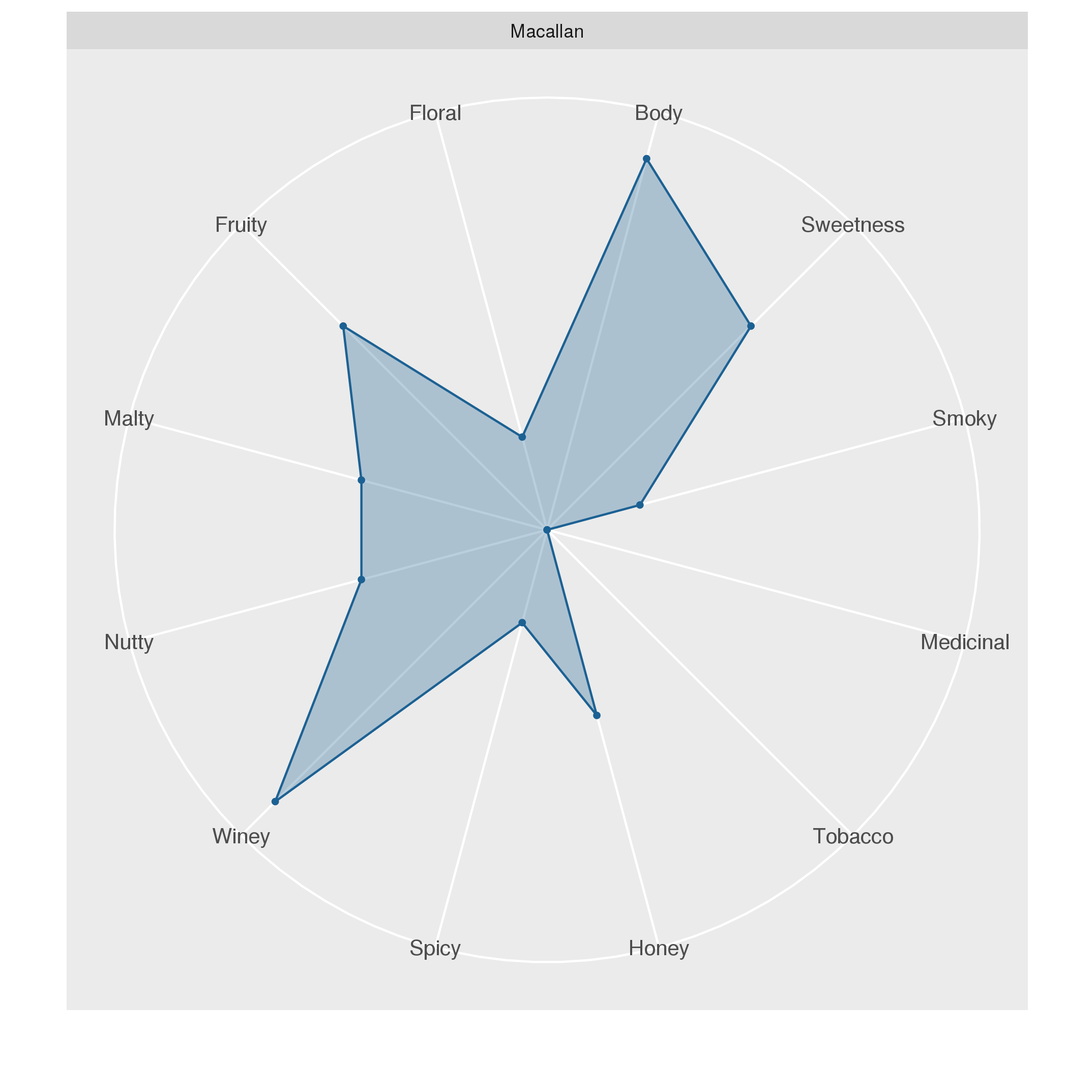
Radar plots visualize several variables using a radial layout. This plot is most suitable for visualizing and comparing the properties associated with individual objects. In the following, we will use a radar plot for comparing the characteristics of whiskeys from different distilleries.
A data set on whiskey Some of you may already know that radar plots are well-suited for visualizing whiskey flavors. I saw this type of visualization first, when I visited the Talisker distillery, the only whiskey distillery on the Isle of Skye.
Interpreting generalized linear models (GLM) obtained through glm is similar to interpreting conventional linear models. Here, we will discuss the differences that need to be considered.
Basics of GLMs GLMs enable the use of linear models in cases where the response variable has an error distribution that is non-normal. Each distribution is associated with a specific canonical link function. A link function \(g(x)\) fulfills \(X \beta = g(\mu)\). For example, for a Poisson distribution, the canonical link function is \(g(\mu) = \text{ln}(\mu)\).
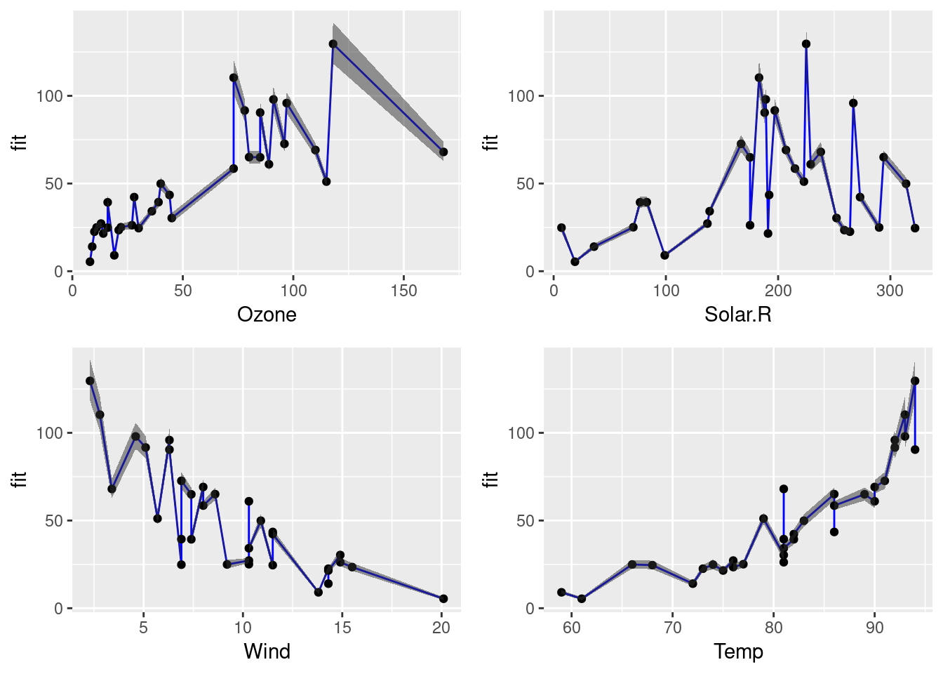
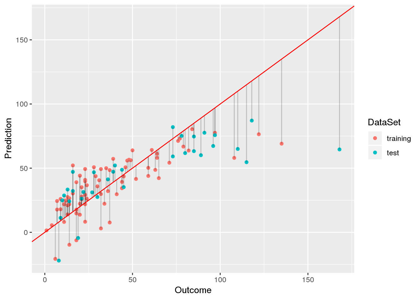
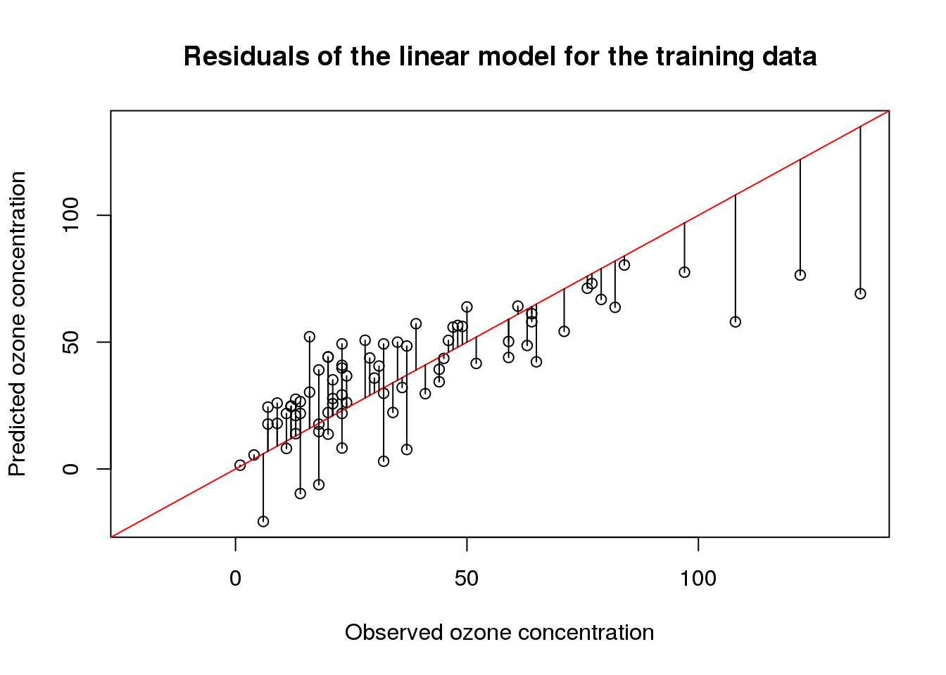
In a previous post, I have introduced the airquality data set in order to demonstrate how linear models are interpreted. In this post, I will start with a basic linear model and, from there, try to find a linear model with a better fit.
Data preprocessing Since the airquality data set contains some missing values, we will remove those before we begin to fit models and select 70% of the samples for training and use the remainder for testing:
Although linear models are one of the simplest machine learning techniques, they are still a powerful tool for predictions. This is particularly due to the fact that linear models are especially easy to interpret. Here, I discuss the most important aspects when interpreting linear models by example of ordinary least-squares regression using the airquality data set.
The airquality data set The airquality data set contains 154 measurements of the following four air quality metrics as obtained in New York:
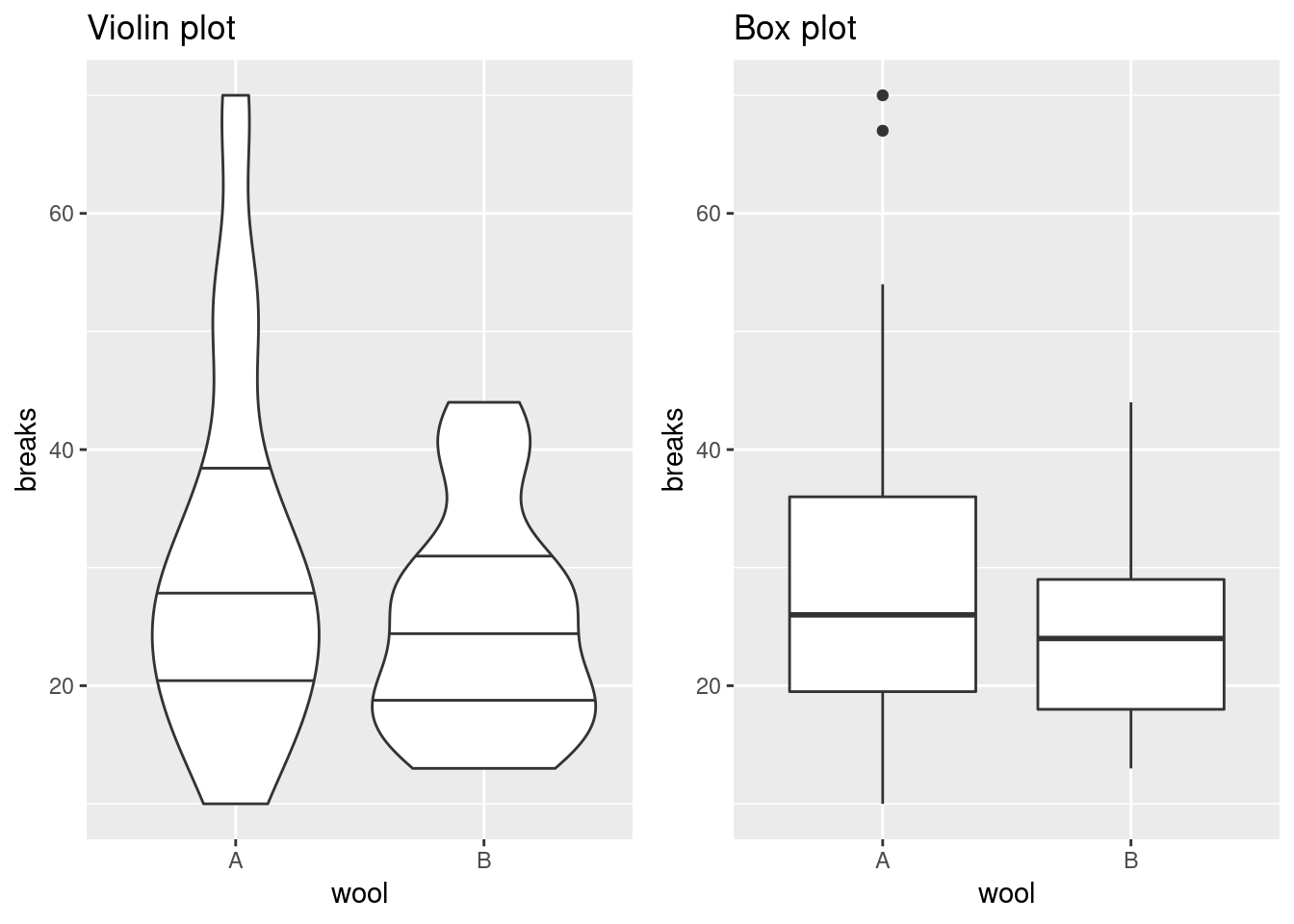
Box plots are great as they do not only indicate the median value but also show the variation of the measurements in terms of the 1st and 3rd quartiles. There are, however, also plots that provide a bit of additional information. Here, we take a closer look at potential alternatives to the box plot: the beeswarm and the violin plot.
The beeswarm plot An implementation of the beeswarm plot is available via the beeswarm package.
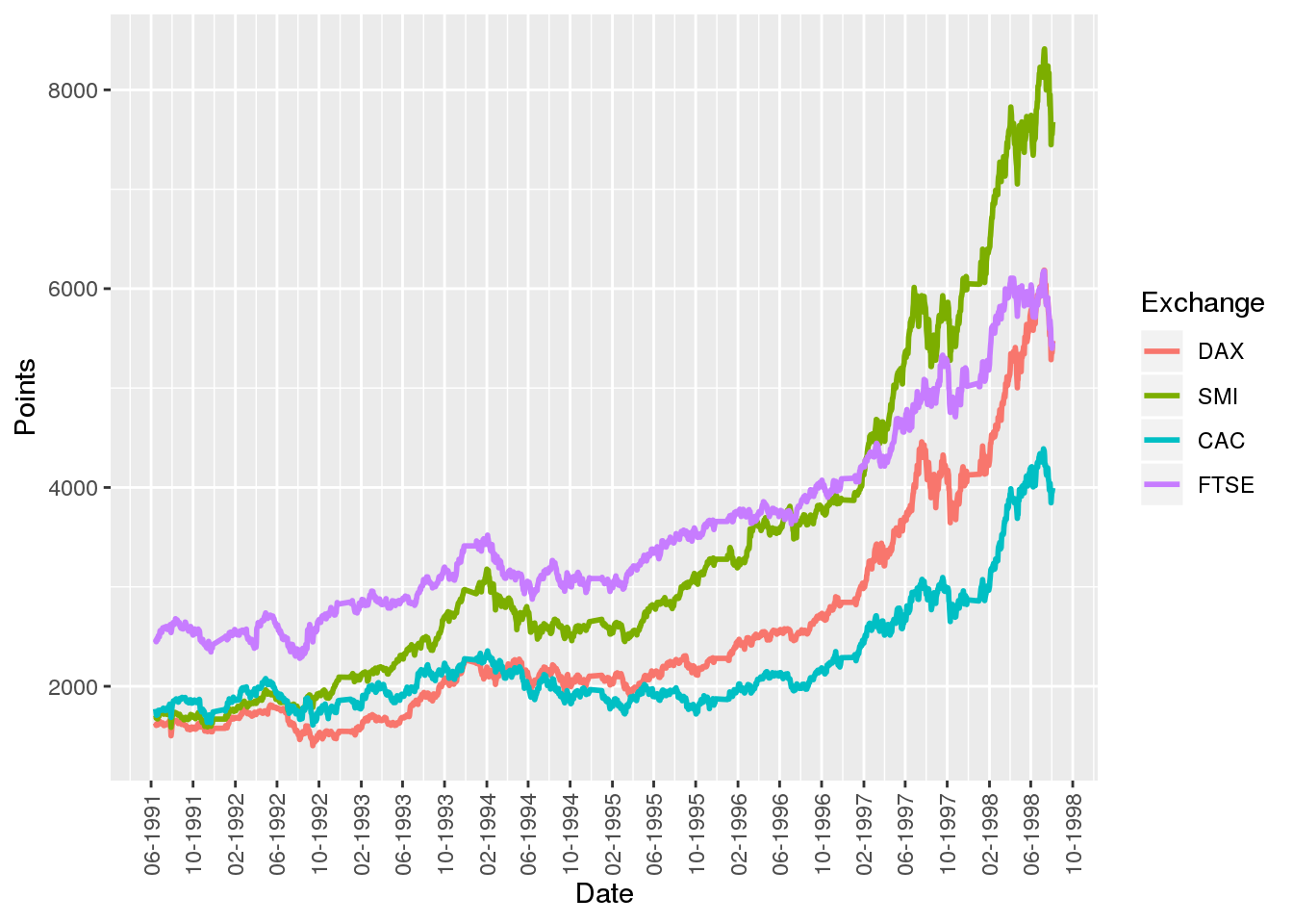
The line plot is the go-to plot for visualizing time-series data (i.e. measurements for several points in time) as it allows for showing trends along time. Here, we’ll use stock market data to show how line plots can be created using native R, the MTS package, and ggplot.
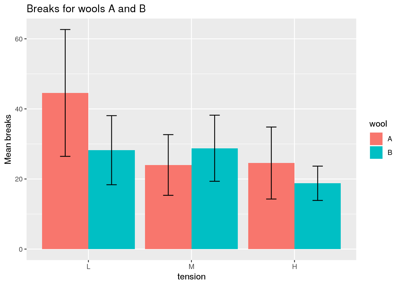
Bar plots display quantities according to the height of bars. Since standard bar plots do not indicate the level of variation in the data, they are most appropriate for showing individual values (e.g. count data) rather than aggregates of several values (e.g. arithmetic means). Although variation can be shown through error bars, this is only appropriate if the data are normally distributed.
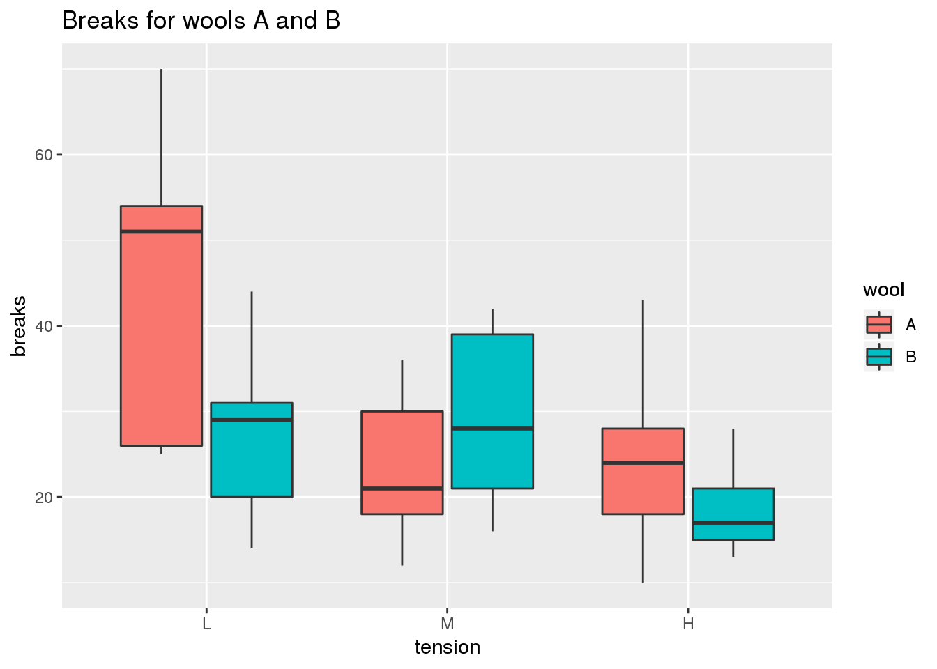
The box plot is useful for comparing the quartiles of quantitative variables. More specifically, lower and upper ends of a box (the hinges) are defined by the first (Q1) and third quartile (Q3). The median (Q2) is shown as a horizontal line within the box. Additionally, outliers are indicated by the whiskers of the boxes whose definition is implementation-dependent. For example, in geom_boxplot of ggplot2, whiskers are defined by the inter-quartile range (IQR = Q3 - Q1), extending no further than 1.5 * IQR.
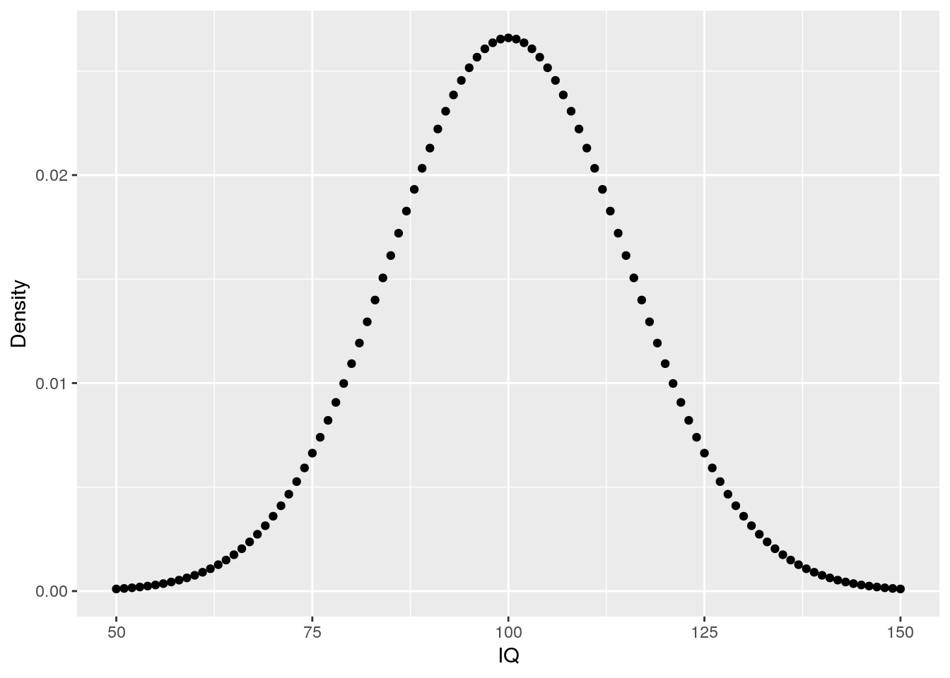
R is a great tool for working with distributions. However, one has to know which specific function is the right wrong. Here, I’ll discuss which functions are available for dealing with the normal distribution: dnorm, pnorm, qnorm, and rnorm.
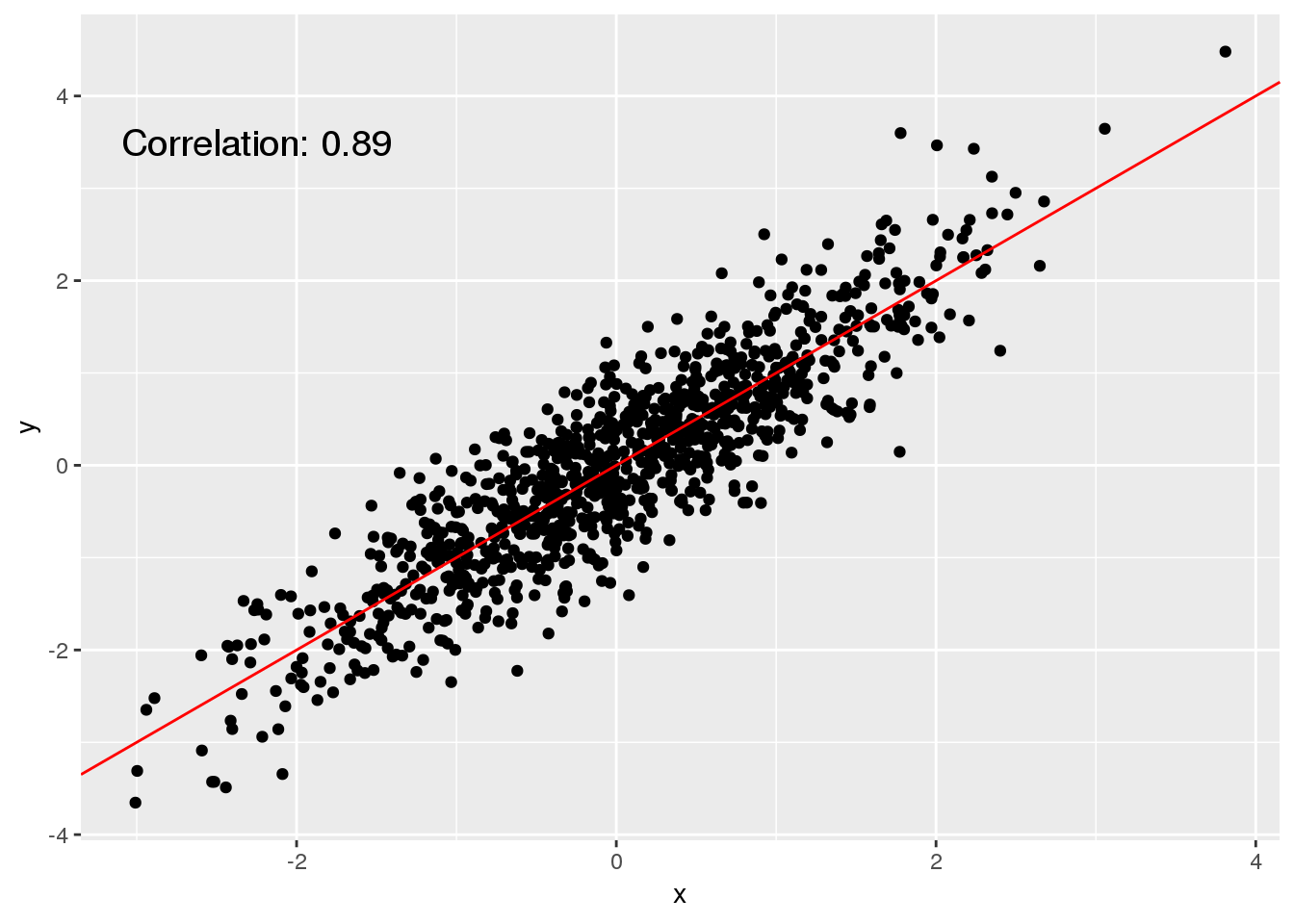
The scatter plot is probably the most simple type of plot that is available because it doesn’t do anything more than to show individual measurements as points in a plot. The scatter plot is particularly useful for investigating whether two variables are associated.

