Bar Plots and Error Bars
Plotting a histogram in native R
We will use the warpbreaks data set to exemplify the use of bar plots.
To obtain a bar plot in native R, we can use the barplot function.
data(warpbreaks)
# create positions for tick marks, one more than number of bars
x <- warpbreaks$breaks
# create labels
x.labels <- paste0(warpbreaks$wool, "-", warpbreaks$tension)
# specify colors for groups
group.cols <- c("darkred", "red", "darksalmon",
"darkblue", "blue", "lightblue")
cols <- c(rep(group.cols[1], 9), rep(group.cols[2], 9),
rep(group.cols[3], 9), rep(group.cols[4], 9),
rep(group.cols[5], 9), rep(group.cols[6], 9))
barplot(x, space = 0, col = cols)
legend("topright", legend = c(unique(x.labels)), col = group.cols, pch = 20)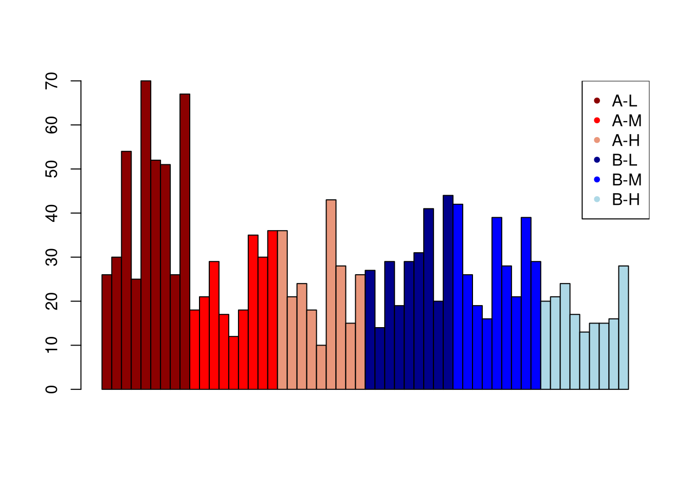 A disadvantage of this approach is that it is tedious to specify the coloring vector if there are many group combinations.
Plotting a histogram with ggplot
To compare the breaks associated with the two types of wool, we’ll use facet_wrap so as to create a facet for wool A and wool B, respectively.
library(ggplot2)
# need 'stat = "identity"' because we provide y values
ggplot(warpbreaks, aes(x = tension, y = breaks)) +
    geom_bar(stat = "identity") + facet_wrap(.~wool) +
    ggtitle("Breaks for wool A and B")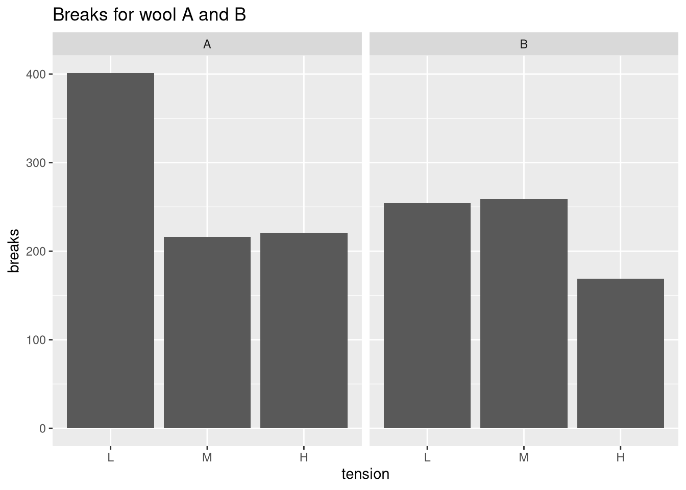
This plot shows the total number of strand breaks. We can verify this in the following way:
sum(warpbreaks$breaks[warpbreaks$wool == "A" & warpbreaks$tension == "L"])## [1] 401Because there are nine measurements for every combination of wool and tension, this is an appropriate summary statistic. However, the sum of breaks it not very interpretable as it does not allow us to measure the average number of breaks and the associated variation.
Plotting means and error bars (68% confidence interval)
To improve the interpretability of the plot, we will compute the mean and the standard deviation. We will then plot the mean number of strand breaks and indicate the standard deviation using error bars. If the data are normally distributed, error bars defined by one standard deviation indicate the 68% confidence interval.
In the first
library(plyr)
# compute mean and sd per combination of wool & tension
df <- ddply(warpbreaks, c("wool", "tension"), summarize, Mean = mean(breaks), SD = sd(breaks))
ggplot(df, aes(x = tension, y = Mean)) +
    geom_bar(stat = "identity") + facet_wrap(.~wool) +
    ggtitle("Breaks for wool A and B") + ylab("Mean breaks") +
    # add 68% CI errorbar
    geom_errorbar(aes(ymin = Mean - SD, ymax = Mean + SD), width = 0.2)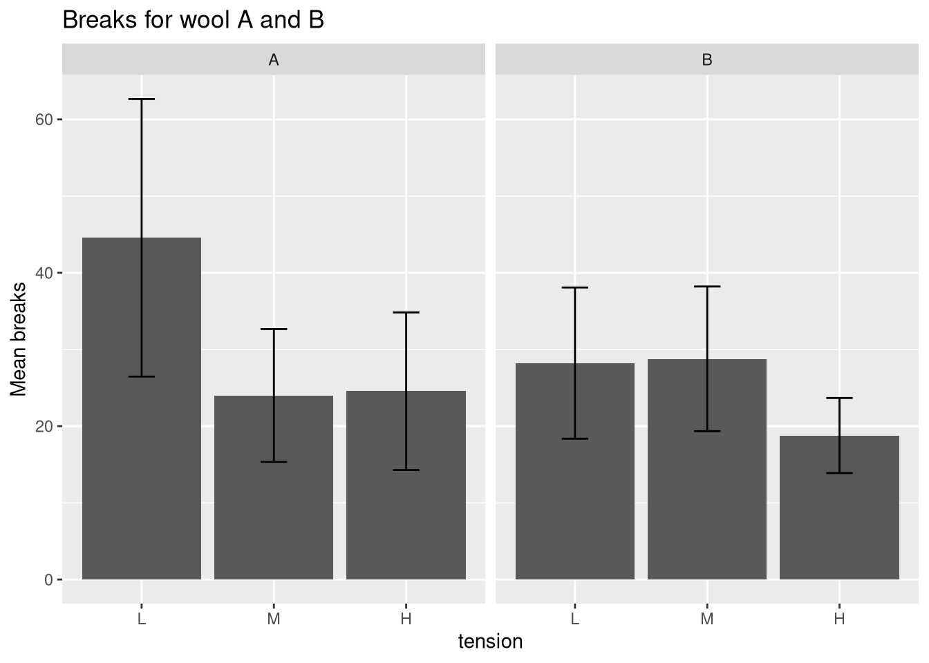
A side-by-side comparison of the two wools can be obtained if facet_wrap is not used and the geom_bar position argument is set to dodge.
ggplot(df, aes(x = tension, y = Mean, fill = wool)) +
    geom_bar(stat = "identity", position = "dodge") +
    ggtitle("Breaks for wool A and B") + ylab("Mean breaks") +
    geom_errorbar(aes(ymin = Mean - SD, ymax = Mean + SD), width = 0.2,
        position = position_dodge(0.9))
Plotting means and error bars (95% confidence interval)
In the next plot, we will draw the 95% confidence interval by defining the error bars using a standard deviation of 1.95. Additionally, we will display the mean values using geom_text.
ggplot(df, aes(x = tension, y = Mean, fill = wool)) +
    geom_bar(stat = "identity", position = "dodge") +
    ggtitle("Breaks for wool A and B") + ylab("Mean breaks") +
    geom_errorbar(aes(ymin = Mean - 1.96 * SD, ymax = Mean + 1.96 * SD), width = 0.2, position = position_dodge(0.9)) +
    geom_text(aes(label = round(Mean, 2)), size = 6,
    position = position_dodge(0.85), vjust = -0.5)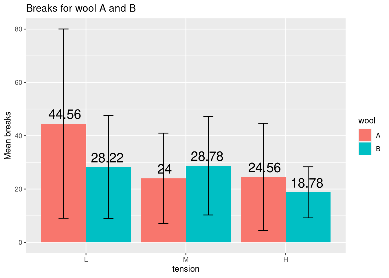
Box plot alternatives
As you can see from the last plot, the bar plot is inappropriate for highly variable measurements with outliers because then the mean is ill-defined and the error bars tend to dominate the visuals. Therefore, in these cases, I’d recommend a plot that is tailored towards displaying variation such as a box plot, which displays the first, second, and third quartiles.
Just compare the following two plots, which clearly demonstrate that the box plot is superior for these data.
p.bar <- ggplot(df, aes(x = tension, y = Mean, fill = wool)) +
    geom_bar(stat = "identity", position = "dodge") +
    geom_errorbar(aes(ymin = Mean - 1.96 * SD, ymax = Mean + 1.96 * SD),
    width = 0.2, position = position_dodge(0.9)) +
    ggtitle("Bar plot")
p.box <- ggplot(warpbreaks, aes(x = tension, y = breaks, fill = wool)) +
    geom_boxplot() + ggtitle("Box plot")
# load gridExtra to show plots side-by-side using grid.arrange
require(gridExtra)
grid.arrange(p.bar, p.box, ncol=2)
If you would like to learn more, just read one of my previous posts about situations when the median is more appropriate than the mean.


Comments
There aren't any comments yet. Be the first to comment!