Visualizing Individual Data Points Using Scatter Plots
Artificial data for the scatter plot
A typical application of scatter plots is for visualizing the correlation between two variables. For this purpose, we’ll create a function that generates correlated measurements.
set.seed(1)
generator <- function(n = 1000) {
    x <- rnorm(n)
    # add some noise to x
    noise <- rnorm(n, 0, sd = 0.5)
    y <- x + noise
    df <- data.frame(x = x, y = y)
    return(df)
}
df <- generator(1000)
Scatter plots in native R
In native R, you can create a simple scatter plot in this way:
plot(df$x, df$y)
# show diagonal line indicating perfect correlation
dg <- par("usr")
segments(dg[1],dg[3],dg[2],dg[4], col='red') 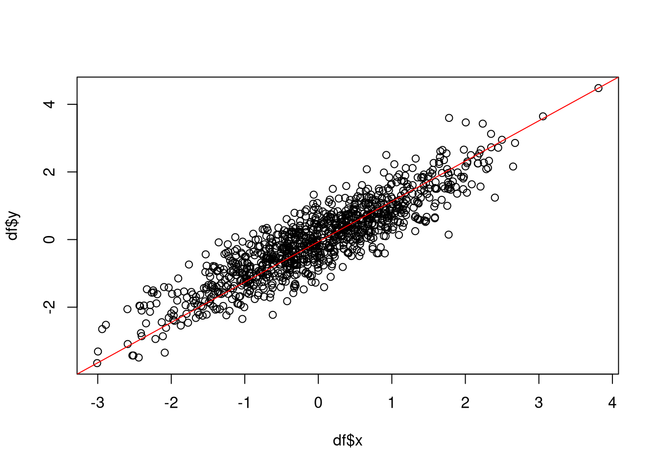
As we can see, the two variables are strongly correlated (correlation of 0.89).
If you want to visualize the correlation of several variables simultaneously, you can use the pairs function in order to create a scatter plot matrix. This matrix represents the correlation for all pairs of variables in a data frame that are selected by the formula argument.
data(mtcars)
pairs(~wt+hp+qsec, data = mtcars)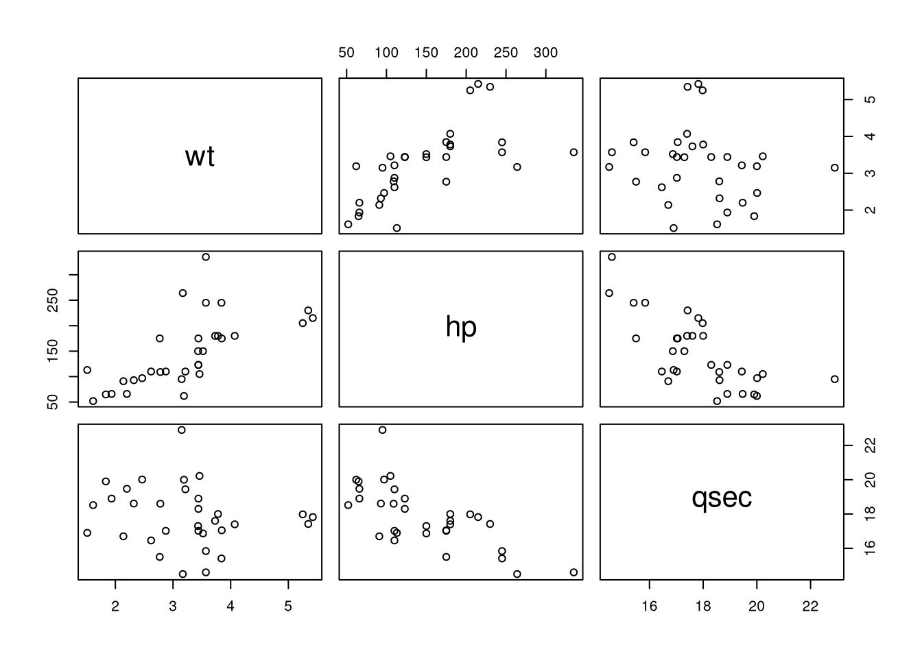
In this case, you would find that there is some correlation between the features wt and hp.
Scatter plots with ggplot
If you prefer using ggplot, then you can create a scatter plot using geom_point. To give the plot more of a nice touch, you can also include the correlation.
library(ggplot2)
cor.val <- round(cor(df$x, df$y), 2)
cor.label <- paste0("Correlation: ", cor.val)
ggplot(df, aes(x = x, y = y)) + geom_point() +
    geom_abline(color = "red", slope = 1) +
    annotate(x = -2.25, y = 3.5,  geom = "text",
            label = cor.label, size = 5)
To show the distribution of the data in more detail, you can also draw a 2D density.
ggplot(df, aes(x = x, y = y)) + geom_point() +
    geom_density_2d()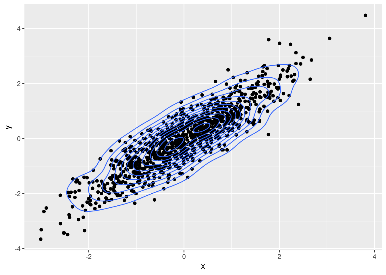
The ellipses of the density indicate where the values are concentrated and allow you to whether a sufficient range of values has been sampled. In this case, the values span the possible range of values well and there are few outliers, so we can be confident about the identified correlation.


Comments
There aren't any comments yet. Be the first to comment!