Visualizing Time-Series Data with Line Plots
The EuStockMarkets data set
The EuStockMarkets data set contains the daily closing prices (except for weekends/holidays) of four European stock exchanges: the DAX (Germany), the SMI (Switzerland), the CAC (France), and the FTSE (UK). An important characteristic of these data is that they represent stock market points, which have different interpretations depending on the exchange. Thus, one should not compare points between different exchanges.
data(EuStockMarkets)
summary(EuStockMarkets)
## DAX SMI CAC FTSE
## Min. :1402 Min. :1587 Min. :1611 Min. :2281
## 1st Qu.:1744 1st Qu.:2166 1st Qu.:1875 1st Qu.:2843
## Median :2141 Median :2796 Median :1992 Median :3247
## Mean :2531 Mean :3376 Mean :2228 Mean :3566
## 3rd Qu.:2722 3rd Qu.:3812 3rd Qu.:2274 3rd Qu.:3994
## Max. :6186 Max. :8412 Max. :4388 Max. :6179class(EuStockMarkets)## [1] "mts" "ts" "matrix"What is interesting is that the data set is not only a matrix but also an mts and ts object, which indicate that this is a time-series object.
In the following, I will show how these data can be plotted with native R, the MTS package, and, finally, ggplot.
Creating a line plot in native R
Creating line plots in native R is a bit messy because the lines function does not create a new plot by itself.
# create a plot with 4 rows and 1 column
par(mfrow=c(4,1))
# set x-axis to number of measurements
x <- seq_len(nrow(EuStockMarkets))
for (i in seq_len(ncol(EuStockMarkets))) {
    # plot stock exchange points
    y <- EuStockMarkets[,i]
    # show stock exchange name as heading
    heading <- colnames(EuStockMarkets)[i]
    # create empty plot as template, don't show x-axis
    plot(x, y, type="n", main = heading, xaxt = "n")
    # add actual data to the plot
    lines(x, EuStockMarkets[,i])
    # adjust x tick labels to years
    years <- as.integer(time(EuStockMarkets))
    tick.posis <- seq(10, length(years), by = 100)
    axis(1, at = tick.posis, las = 2, labels = years[tick.posis])
}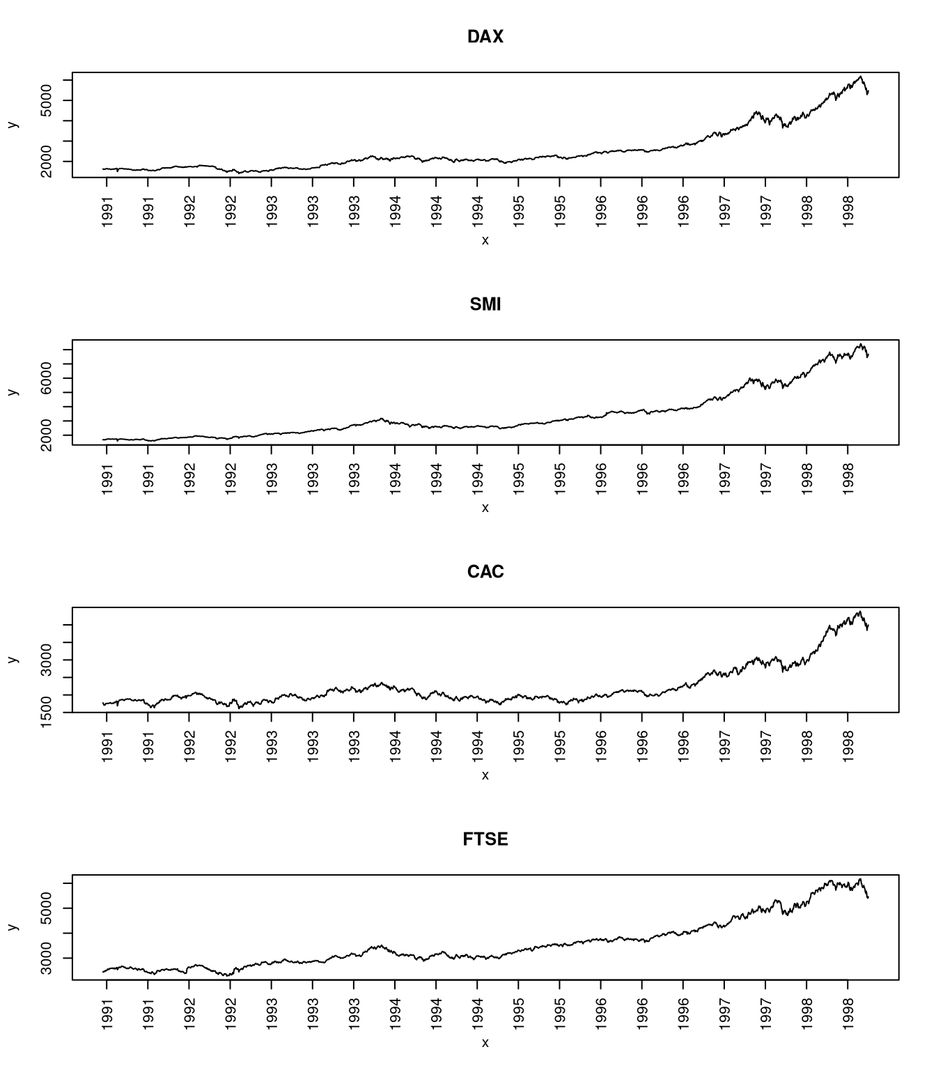
The plot shows us that all of the European stock exchanges are highly correlated and we could use the plot to explain the stock market variation based on past economic events.
Note that this is a quick and dirty way of creating the plot because it assumes that the time between all measurements is identical. This approximation is acceptable for this data set because there are (nearly) daily measurements. However, if there were time periods with lower sampling frequency, this should be shown by scaling the axis according to the dates of the measured (see the ggplot example below).
Creating a line plot of an MTS object
If you have an object of type mts, then it is much easier to use the plot function associated with the mts object, plots.mts, which is provided by the stats package that is included with every R distribution. This plotting functions gives a similar but admittedly improved plot than the one I manually created above.
plot(EuStockMarkets)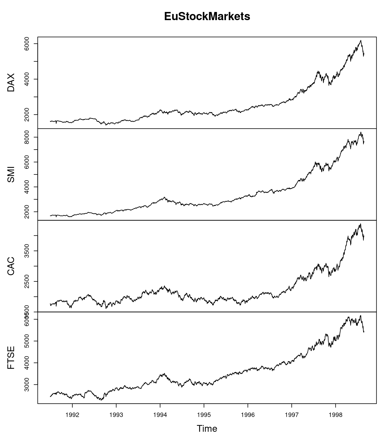
Creating a line plot with ggplot
Creating a ggplot version of the line plot can either be done by hand, which is quite cumbersome, or via the zoo package, which is much more convenient.
The manual approach
To create the same plot with ggplot, we need to construct a data frame first. In this example, we want to consider the dates at which the measurements were taken when scaling the x-axis.
The problem here is that the mts object doesn’t store the years as dates but as floating point numbers. For example, a value of 1998.0 indicates a day in the beginning of 1998, while 1998.9 indicates a value at the end if 1998. Since I could not find a function that transforms such representations, we will create a function that transforms this numeric representation to dates.
scale.value.range <- function(x, old, new) {
   # scale value from interval (min/max) 'old' to 'new'
   scale <- (x - old[1]) / (old[2] - old[1])
   newscale <- new[2] - new[1]
   res <- scale * newscale + new[1]
   return(res)
}
float.to.date <- function(x) {
    # convert a float 'x' (e.g. 1998.1) to its Date representation
    year <- as.integer(x)
    # obtaining the month: consider decimals
    float.val <- x - year
    # months: transform from [0,1) value range to [1,12] value range
    mon.float <- scale.value.range(float.val, c(0,1), c(1,12))
    mon <- as.integer(mon.float)
    date <- get.date(year, mon.float, mon)
    return(date)
}
days.in.month <- function(year, mon) {
    # day: transform based on specific month and year (leap years!)
    date1 <- as.Date(paste(year, mon, 1, sep = "-"))
    date2 <- as.Date(paste(year, mon+1, 1, sep = "-"))
    days <- difftime(date2, date1)
    return(as.numeric(days))
}
get.date <- function(year, mon.float, mon) {
    max.nbr.days <- days.in.month(year, mon)
    day.float <- sapply(seq_along(year), function(x)
        scale.value.range(mon.float[x] - mon[x], c(0,1), c(1,max.nbr.days[x])))
    day <- as.integer(day.float)
    date.rep <- paste(as.character(year), as.character(mon),
                as.character(day), sep = "-")
    date <- as.Date(date.rep, format = "%Y-%m-%d")
    return(date)
}

mts.to.df <- function(obj) {
    date <- float.to.date(as.numeric(time(obj)))
    df <- cbind("Date" = date, as.data.frame(obj))
    return(df)
}
library(ggplot2)
df <- mts.to.df(EuStockMarkets)
# go from wide to long format
library(reshape2)
dff <- melt(df, "Date", variable.name = "Exchange", value.name = "Points")
# load scales to format dates on x-axis
library(scales)
ggplot(dff, aes(x = Date, y = Points)) +
  geom_line(aes(color = Exchange), size = 1) +
  # use date_breaks to have more frequent labels
  scale_x_date(labels = date_format("%m-%Y"), date_breaks = "4 months") +
  # rotate x-axis labels
  theme(axis.text.x = element_text(angle = 90, vjust = 0.5))
Creating the ggplot visualization for this example involved more work because I wanted to have an improved representation of the dates as for the other two approaches for creating the plot. For a faster, yet less accurate representation, the plot could have also been created by ignoring the months and just using the years, as in the first example.
Creating the plot with the zoo package
To create a ggplot version of the plot, we can use the autoplot function from ggplot2, ater transforming the mts object to a zoo object via as.zoo:
library(zoo)
zooMarkets <- as.zoo(EuStockMarkets)
#autoplot(zooMarkets) # plot with facets
autoplot(zooMarkets, facet = NULL) # plot without facets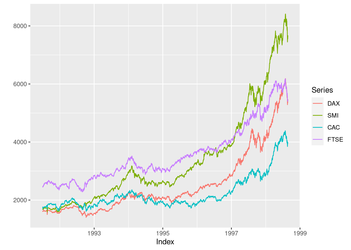
Rather than using the custom mts.to.df function, we could have also used the ggplot2’s fortify function on the zoo object in order to convert it to a data frame:
market.df <- fortify(zooMarkets)
print(head(market.df))
## Index DAX SMI CAC FTSE
## 1 1991.496 1628.75 1678.1 1772.8 2443.6
## 2 1991.500 1613.63 1688.5 1750.5 2460.2
## 3 1991.504 1606.51 1678.6 1718.0 2448.2
## 4 1991.508 1621.04 1684.1 1708.1 2470.4
## 5 1991.512 1618.16 1686.6 1723.1 2484.7
## 6 1991.515 1610.61 1671.6 1714.3 2466.8Note, however, that the Index column provides the date as a floating point number rather than as a Date as in the mts.to.df function.
R Packages for time-series data
Additional functions for multivariate time-series data are available via the MTS package. For irregular time-series data, the XTS and zoo packages are useful.


Comments
Achim Zeileis
03 Dec 18 00:28 UTC
Thanks for the post. A couple of additions:
MTSpackage is not involved when usingplot(EuStockMarkets). Themtsclass and associated methods is provided by the basicstatspackage.xtsandzoocan be helpful when representing time series that are irregular. They also come with coercion functions to/frommts/ts.zoopackage also provides aggplot2interface, see e.g.,autoplot(as.zoo(EuStockMarkets))orautoplot(as.zoo(EuStockMarkets), facet = NULL)after loading both packages. Thefortify()method forzooobjects is also helpful for preparing time series data as tidy long data frames for subsequent processing inggplot2and friendMatthias Döring
03 Dec 18 10:14 UTC