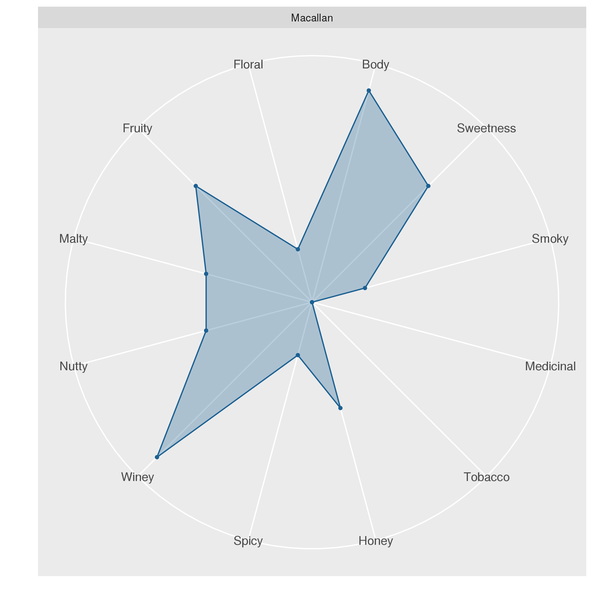
Plots

Plots

There is a large number of different types of plots for visualizing data.

Basic plots

The following plots are frequently used:

  • The bar plot shows the extent of values according to the height of bars. If the data are normally distributed, they can be display variation by including error bars.
  • The box plot indicates variation by showing the most frequently observed measurements in terms of the first, second, and third quartile.
  • The histogram consists of bars that indicate the frequency of measurements and is ideal for showing the distribution of a variable.
  • The line plot connects individual measurements using lines. It is most suited for time-series data.
  • The scatter plot shows the value of two variables as points and is ideal for identifying correlated variables.

Further plots

The following plots are less frequently used than the basic plots. Nevertheless, these plots may be very useful for specific applications.

  • The beeswarm plot is an alternative to the box plot that draws individual data points in a well-defined manner.
  • The Q-Q plot can be used to compare whether two samples have similar distributions.
  • The radar plot shows the values of several properties in a circular layout.
  • The violin plot is an alternative to the box plot that shows a density estimate.
  • The geospatial plot is concerned with drawing the locations of entities on a map.

Posts about plots

The following posts exemplify the use of plots in R.

Radar plots

Radar plots

0
Radar plots visualize several variables using a radial layout. This plot is most suitable for visualizing and comparing the properties associated with individual objects. In the following, we will use a radar plot for comparing the characteristics of whiskeys from different distilleries. A data set on whiskey Some of you may already know that radar plots are well-suited for visualizing whiskey flavors. I saw this type of visualization first, when I visited the Talisker distillery, the only whiskey distillery on the Isle of Skye.
Box Plot Alternatives: Beeswarm and Violin Plots

Box Plot Alternatives: Beeswarm and Violin Plots

1
Box plots are great as they do not only indicate the median value but also show the variation of the measurements in terms of the 1st and 3rd quartiles. There are, however, also plots that provide a bit of additional information. Here, we take a closer look at potential alternatives to the box plot: the beeswarm and the violin plot. The beeswarm plot An implementation of the beeswarm plot is available via the beeswarm package.
Visualizing Time-Series Data with Line Plots

Visualizing Time-Series Data with Line Plots

2

The line plot is the go-to plot for visualizing time-series data (i.e. measurements for several points in time) as it allows for showing trends along time. Here, we’ll use stock market data to show how line plots can be created using native R, the MTS package, and ggplot.

Bar Plots and Error Bars

Bar Plots and Error Bars

0

Bar plots display quantities according to the height of bars. Since standard bar plots do not indicate the level of variation in the data, they are most appropriate for showing individual values (e.g. count data) rather than aggregates of several values (e.g. arithmetic means). Although variation can be shown through error bars, this is only appropriate if the data are normally distributed.

Comparing Medians and Inter-Quartile Ranges Using the Box Plot

Comparing Medians and Inter-Quartile Ranges Using the Box Plot

0

The box plot is useful for comparing the quartiles of quantitative variables. More specifically, lower and upper ends of a box (the hinges) are defined by the first (Q1) and third quartile (Q3). The median (Q2) is shown as a horizontal line within the box. Additionally, outliers are indicated by the whiskers of the boxes whose definition is implementation-dependent. For example, in geom_boxplot of ggplot2, whiskers are defined by the inter-quartile range (IQR = Q3 - Q1), extending no further than 1.5 * IQR.

Determining the Distribution of Data Using Histograms

Determining the Distribution of Data Using Histograms

0

It is always useful to spend some time exploring a new data set before processing it further and analyzing it. One of the most convenient ways to get a feel for the data is plotting a histogram. The histogram is a tool for visualizing the frequency of measurements in terms of a bar plot. Here we’ll take a closer look at how the histogram can be used in R.