Determining the Distribution of Data Using Histograms
Plotting a histogram in native R
The basic histogram fun is hist. It is very easy to use because you only need to provide a numeric vector. For example:
# fix seed for reproducibility
set.seed(1)
# draw n samples from the uniform distribution in the range [0,1]
n <- 100
x <- runif(n)
hist(x)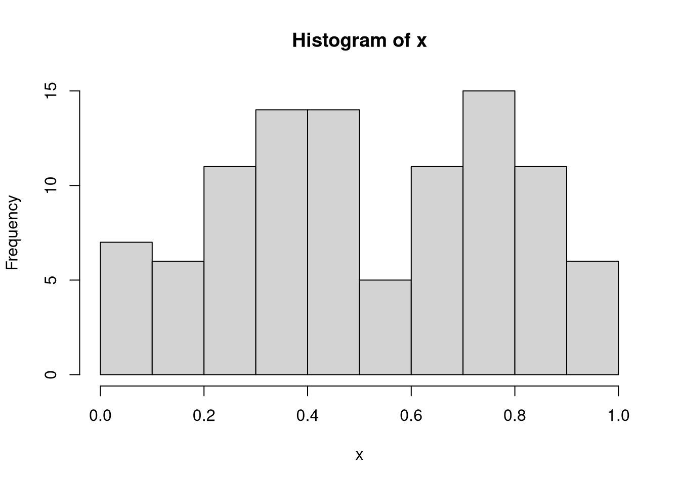
If you need a higher resolution, you can increase the number of bins using the breaks argument:
hist(x, breaks = 20)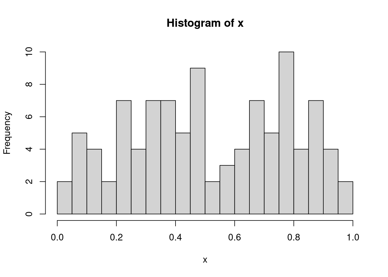
These results indicate that although the samples were drawn from the uniform distribution, there are still some values that are over- and underrepresented.
Plotting a histogram using ggplot
If you want to have more control over your plots, then you should use the ggplot2 library, which is part of the tidyverse suite. Since the plotting function expects a data frame, we’ll have to construct one first:
library(ggplot2)
df <- data.frame(x = x)
# map data frame values in column x to x-axis and plot
ggplot(df, aes(x = x)) + geom_histogram()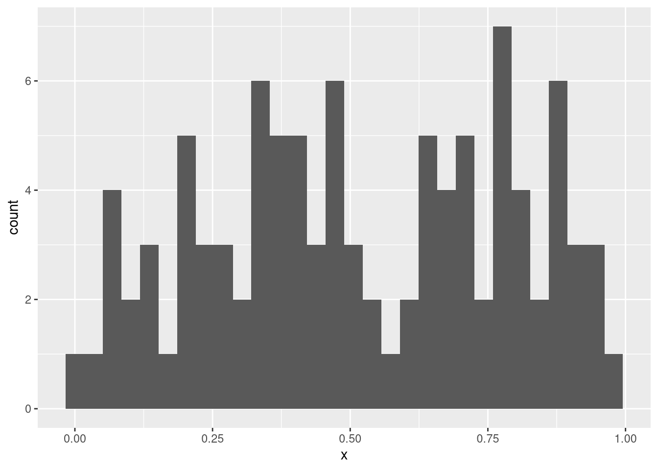
Plotting a histogram for several groups
To exemplify why ggplot is great, let’s assume we have more than one vector we’d like to plot. This can be done in the following way:
# normally distributed data
y <- rnorm(n)
df <- data.frame(Category = c(rep("Uniform", n), rep("Normal", n)),
                x = c(x, y))
# fill bars according to 'Category'
ggplot(df, aes(x = x, fill = Category)) + geom_histogram()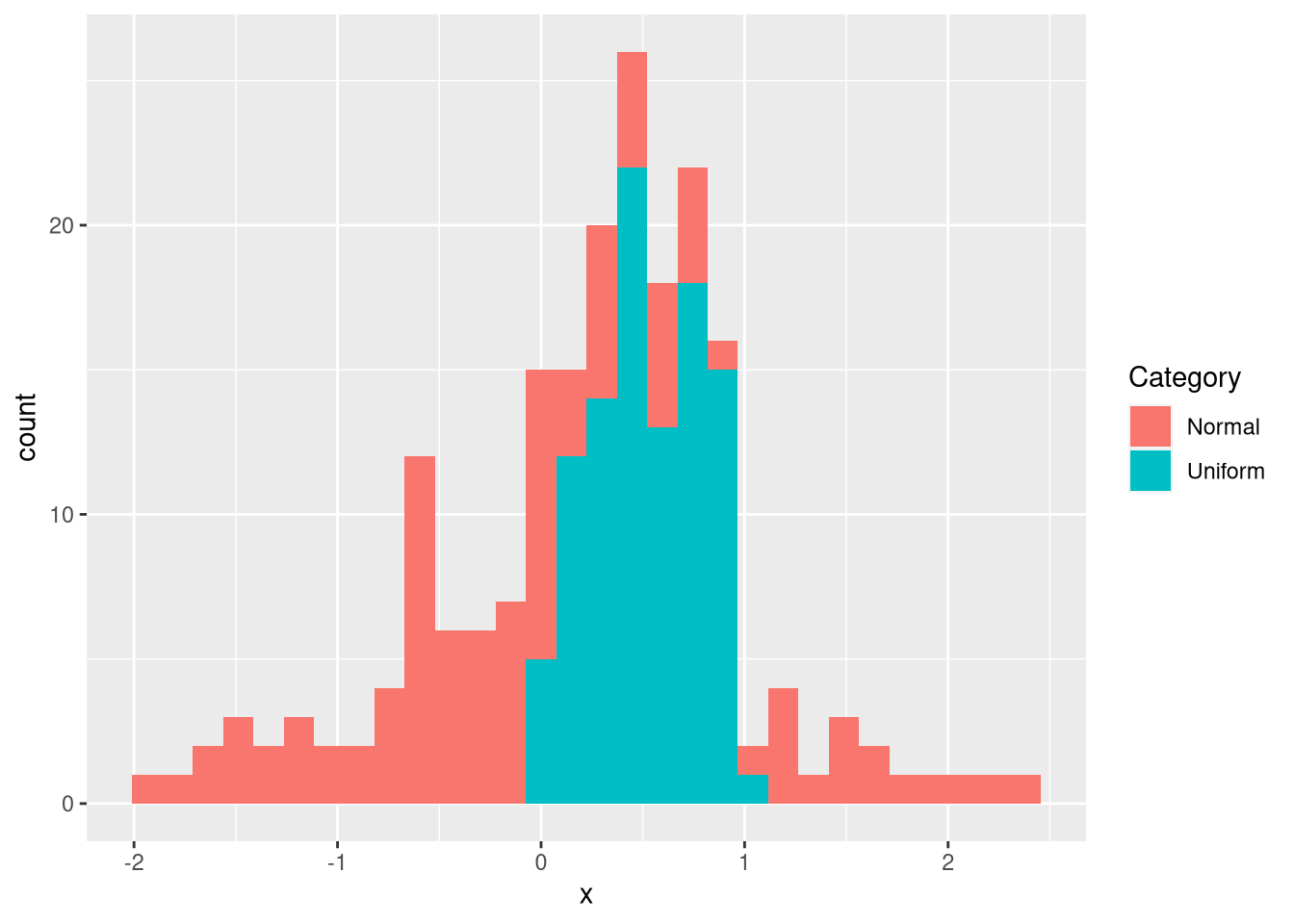
As an alternative to plotting the data within a single plot, one can also use a faceted plot:
ggplot(df, aes(x = x)) + geom_histogram() + facet_wrap(vars(Category))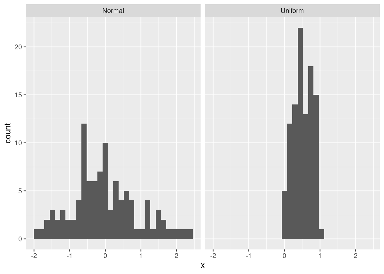
One problem with the facet problem is that the scales may be different for the two axes. For example, the data from the normal distribution have a smaller maximum frequency than those from the uniform distribution. Thus, values from the normal distribution are not clearly visible. Moreover, the uniform data are in a smaller value range than the normal data. To fix this problem, we can provide an additional argument that makes both the x-axis and the y-axis flexible:
ggplot(df, aes(x = x)) + geom_histogram() +
        facet_wrap(vars(Category), scales = "free")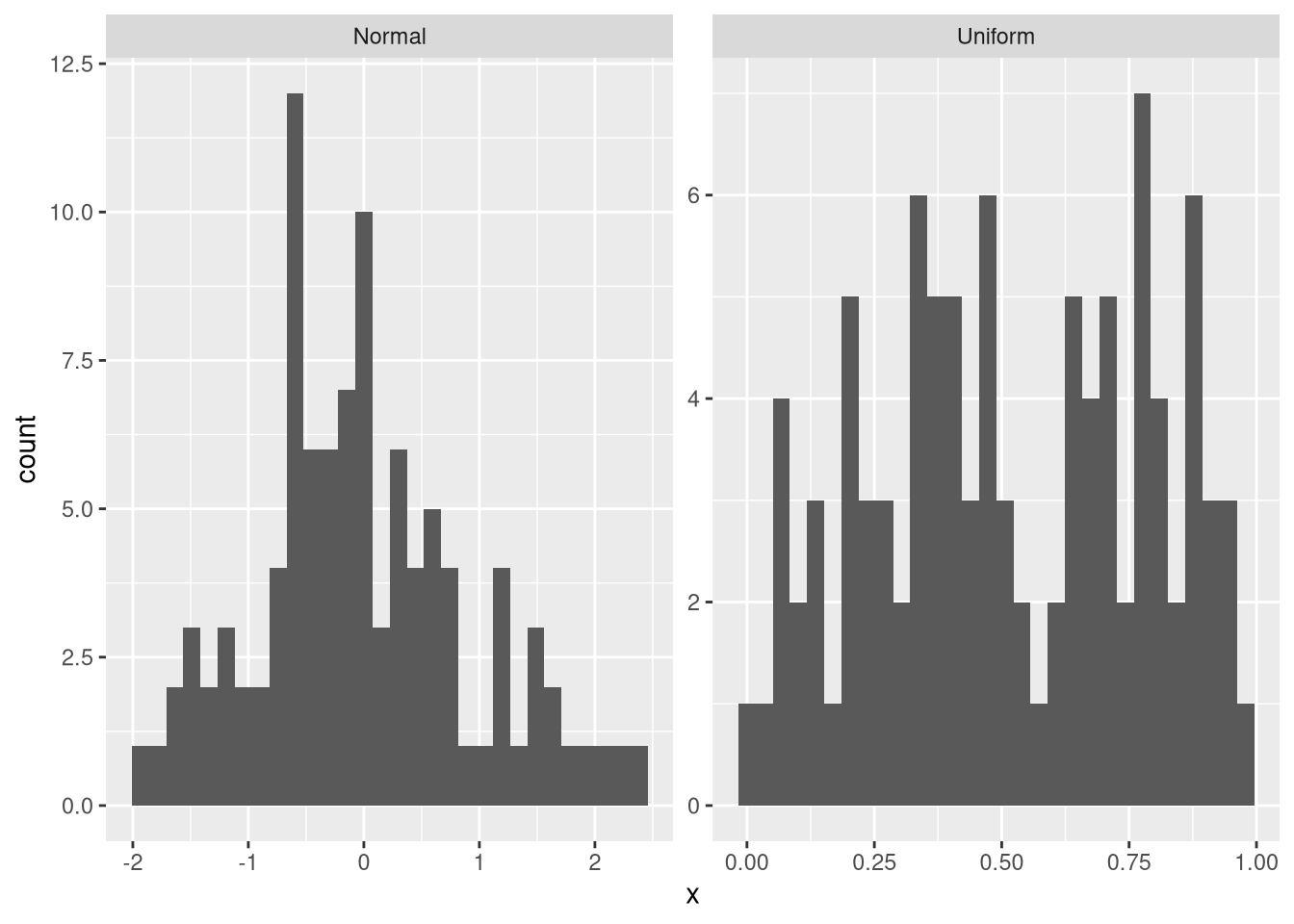
Now, the difference between the two distributions is much more easily visible than before.


Comments
There aren't any comments yet. Be the first to comment!