Interpreting ROC Curves, Precision-Recall Curves, and AUCs
Receiver operating characteristic (ROC) curves are probably the most commonly used measure for evaluating the predictive performance of scoring classifiers.
The confusion matrix of a classifier that predicts a positive class (+1) and a negative class (-1) has the following structure:
| Prediction/Reference Class | +1 | -1 |
|---|---|---|
| +1 | TP | FP |
| -1 | FN | TN |
Here, TP indicates the number of true positives (model predicts positive class correctly), FP indicates the number of false positives (model incorrectly predicts positive class), FN indicates the number of false negatives (model incorrectly predicts negative class), and TN indicates the number of true negatives (model correctly predicts negative class).
ROC Curves
In ROC curves, the true positive rate (TPR, y-axis) is plotted against the false positive rate (FPR, x-axis). These quantities are defined as follows:
\[ \begin{align*} TPR &= \frac{TP}{TP + FN} \\ FPR &= \frac{FP}{FP + TN} \\ \end{align*} \]
Each point in a ROC curve arises from the values in the confusion matrix associated with the application of a specific cutoff on the predictions (scores) of the classifier.
To construct a ROC curve, one simply uses each of the classifier estimates as a cutoff for differentiating the positive from the negative class. To exemplify the construction of these curves, we will use a data set consisting of 11 observations of which 4 belong to the positive class (\(y_i = +1\)) and 7 belong to the negative class (\(y_i = -1\)). The corresponding ROC curve is constructed by applying cutoffs on the estimates (decision values) of the model. Consider the following example:
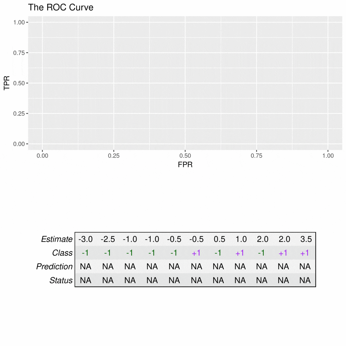
The animation illustrates how correct predictions of the positive class (TPs) lead to increases in the TPR, while false positives (FPs) lead to an increase in the FPR. For example, the TPR first rises to 25% at an FPR of 0% (estimate with \(\hat{y}_i = 3.5\) is correctly predicted and there are no false positives) but then incurs an FPR of 9% to reach a TPR of 50% (one of the estimates with \(\hat{y}_i = 2\) is correctly predicted, the other is a false positive).
The predictive performance of a classifier can be quantified in terms of the are under the ROC curve (AUC), which lies in the range \([0,1]\). In the following, I will demonstrate typical AUC values using the following function:
plot.scores.AUC <- function(y, y.hat, measure = "tpr", x.measure = "fpr") {
    par(mfrow=c(1,2))
    hist(y.hat[y == 0], col=rgb(1,0,0,0.5),
         main = "Score Distribution",
         breaks=seq(min(y.hat),max(y.hat)+1, 1), xlab = "Prediction")
    hist(y.hat[y == 1], col = rgb(0,0,1,0.5), add=T,
            breaks=seq(min(y.hat),max(y.hat) + 1, 1))
    legend("topleft", legend = c("Class 0", "Class 1"),  col=c("red", "blue"), lty=1, cex=1)
    # plot ROC curve
    library(ROCR)
    pr <- prediction(y.hat, y)
    prf <- performance(pr, measure = measure, x.measure = x.measure)
    # get AUC
    auc <- performance(pr, measure = "auc")@y.values[[1]]
    plot(prf, main = paste0("Curve (AUC: ", round(auc, 2), ")"))
}
AUC for a perfect classifier
An ideal classifier does not make any prediction errors. This means that the classifier can perfectly separate the two classes such that the model achieves a true positive rate of 100% before producing any false positives. Thus, the AUC of such a classifier is 1, for example:
set.seed(12345)
# create binary labels
y <- c(rep(0, 70), rep(1, 30))
# simulate scoring classifier
y.hat <- c(rnorm(70, -2, sd = 0.5), rnorm(30, 2, sd = 0.5))
plot.scores.AUC(y, y.hat)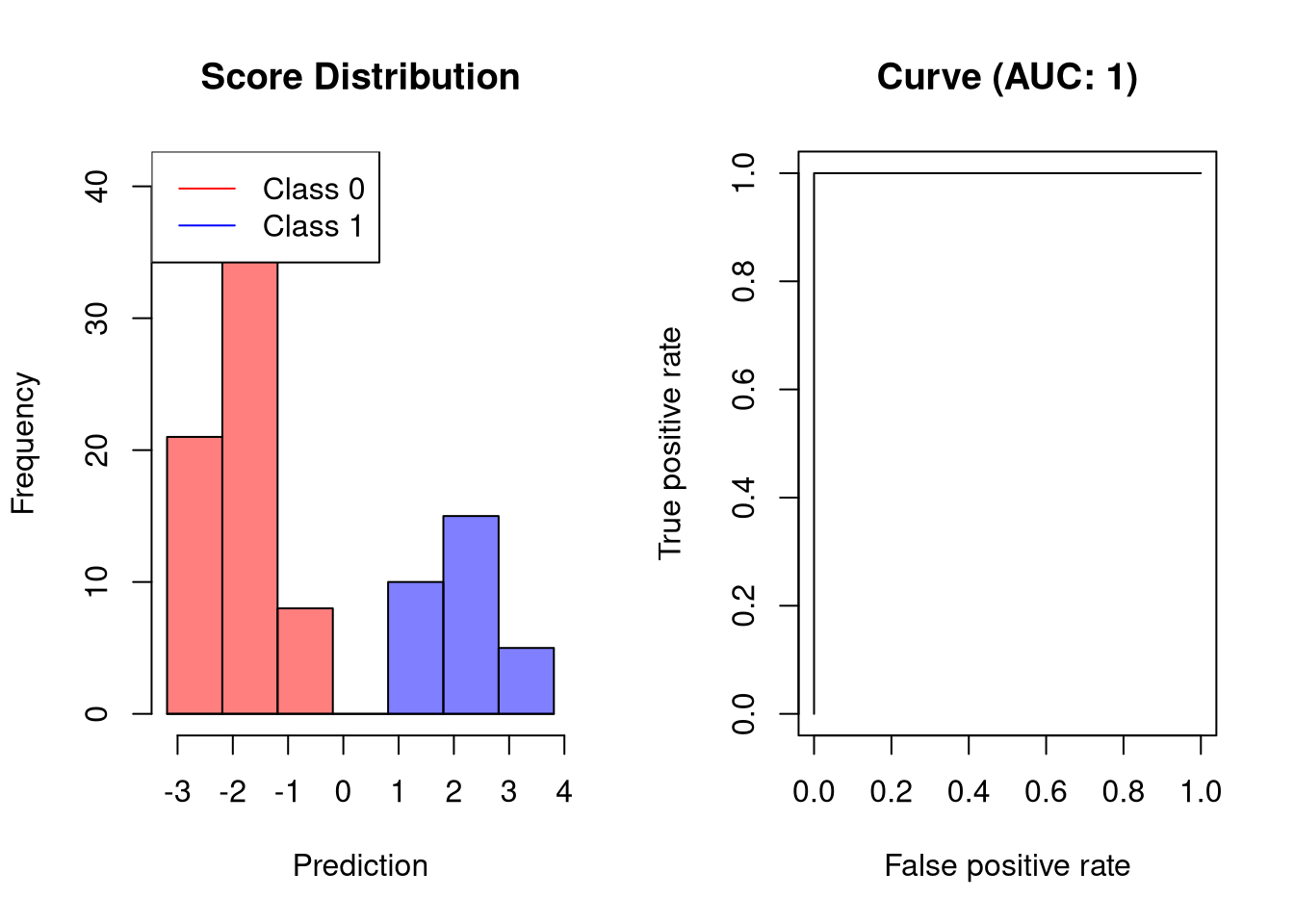
AUC of a good classifier
A classifier that separates the two classes well but not perfectly would look like this:
set.seed(12345)
# create binary labels
y <- c(rep(0, 70), rep(1, 30))
# simulate scoring classifier
y.hat <- c(rnorm(70, -1, sd = 1), rnorm(30, 1, sd = 1.25))
plot.scores.AUC(y, y.hat)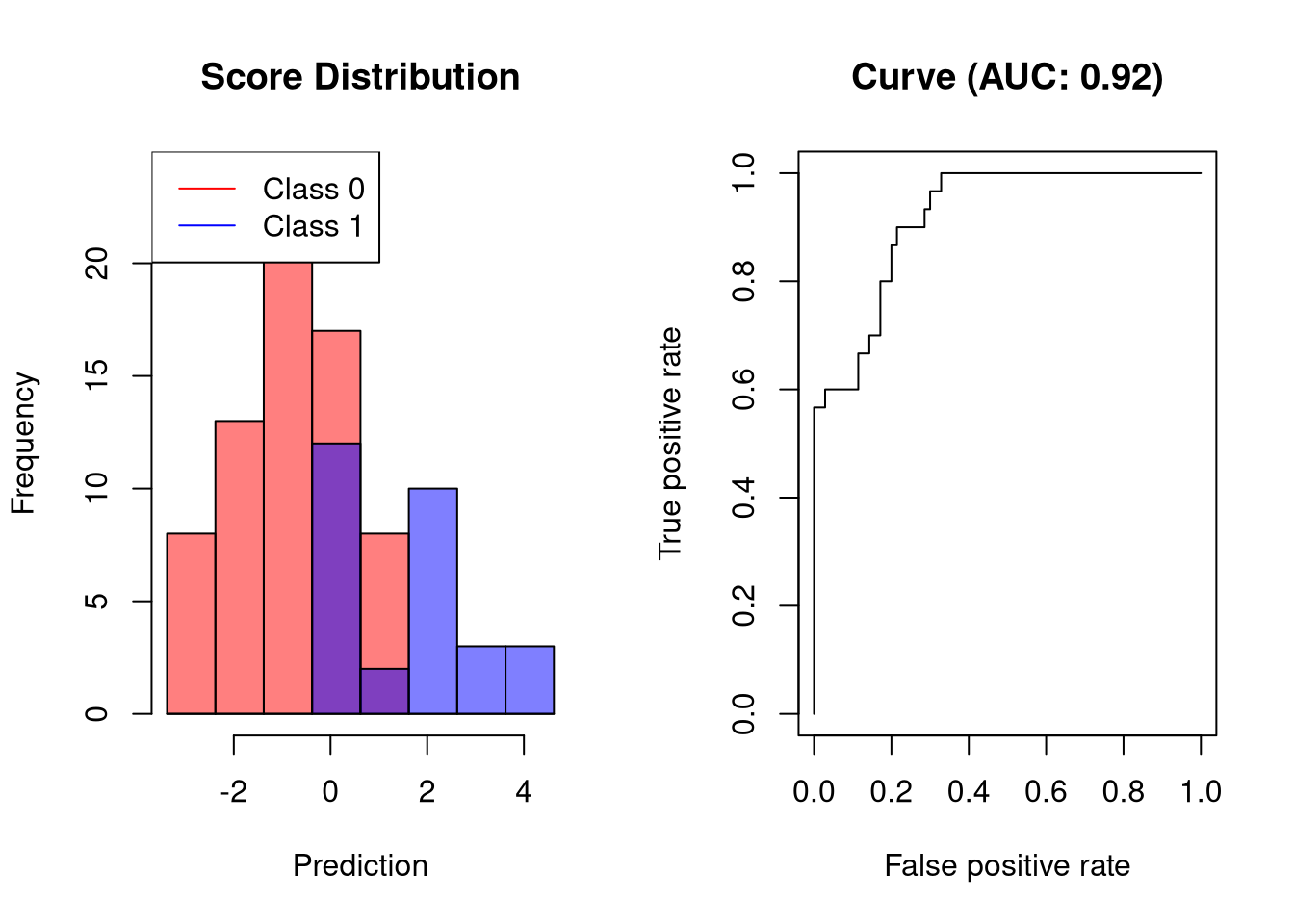
The visualized classifier would be able to obtain a sensitivity of 60% at a very low FPR.
AUC of a bad classifier
A bad classifier will output scores whose values are only slightly associated with the outcome. Such a classifier will reach a high TPR only at the cost of a high FPR.
set.seed(12345)
# create binary labels
y <- c(rep(0, 70), rep(1, 30))
# simulate scoring classifier
y.hat <- c(rnorm(70, -0.5, sd = 1.75), rnorm(30, 0.5, sd = 1.25))
plot.scores.AUC(y, y.hat)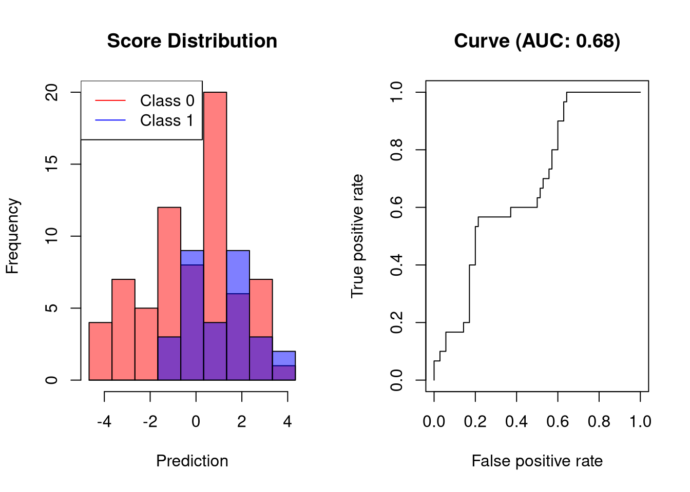
The visualized classifier would reach a sensitivity of 60% only at a FPR of roughly 40%, which is way too high for a classifier that should be of practical use.
AUC of a random classifier
A random classifier will have an AUC close to 0.5. This is easy to understand: for every correct prediction, the next prediction will be incorrect.
set.seed(12345)
# create binary labels
y <- c(rep(0, 70), rep(1, 30))
# simulate scoring classifier
y.hat <- c(rnorm(70, 0, sd = 2), rnorm(30, 0, sd = 2))
plot.scores.AUC(y, y.hat)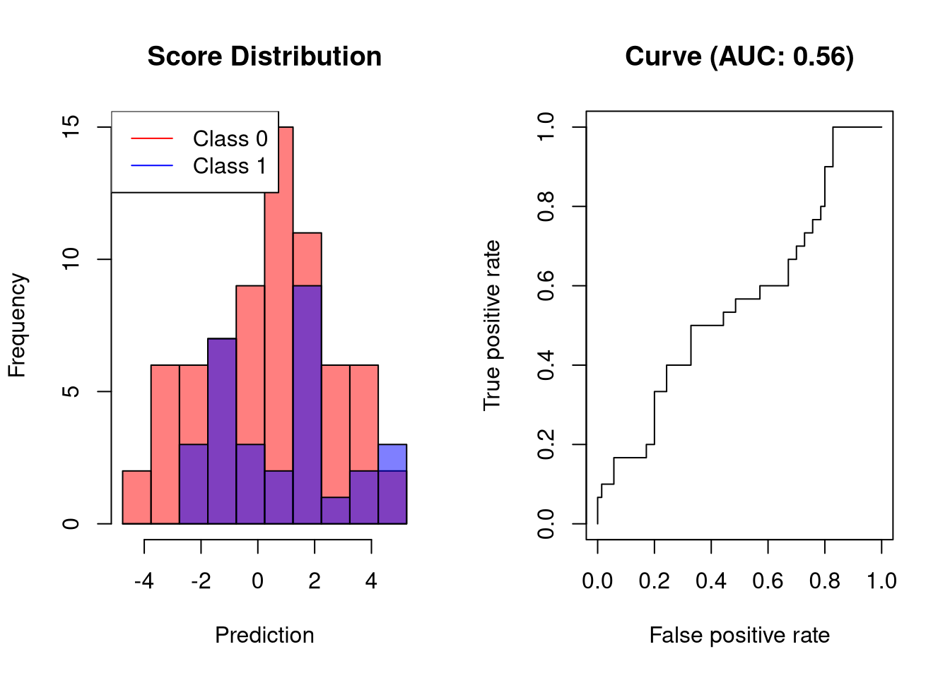
AUC of classifiers that perform worse than random classifiers
Usually, the AUC is in the range \([0.5, 1]\) because useful classifiers should perform better than random. In principle, however, the AUC can also be smaller than 0.5, which indicates that a classifier performs worse than a random classifier. In our example, this would mean that negative values are predicted for the positive class and positive values for the negative class, which would not make much sense. Thus, AUCs lower than 0.5 typically indicate that something has gone wrong, for example, that the labels have been switched.
set.seed(12345)
# create binary labels
y <- c(rep(0, 70), rep(1, 30))
# simulate scoring classifier
y.hat <- c(rnorm(70, 2, sd = 2), rnorm(30, -2, sd = 2))
plot.scores.AUC(y, y.hat)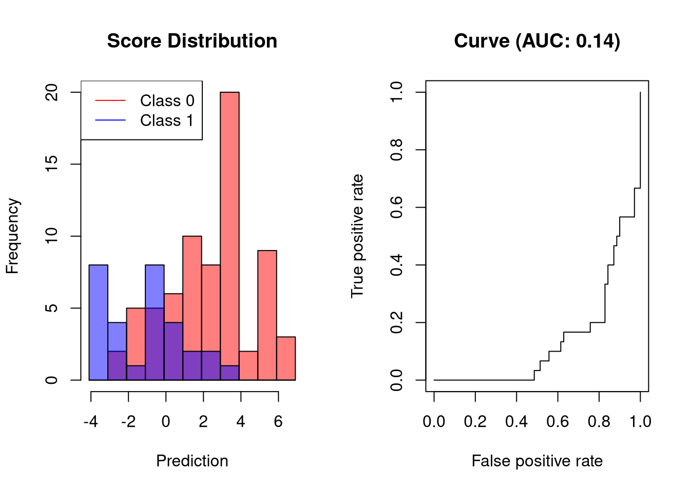
The visualized classifier incurs an FPR of 80% before reaching a sensitivity above 20%.
Precision-Recall Curves
Precision-recall curves plot the positive predictive value (PPV, y-axis) against the true positive rate (TPR, x-axis). These quantities are defined as follows:
\[ \begin{align*} \rm{precision} &= PPV = \frac{TP}{TP + FP} \\ \rm{recall} &= TPR = \frac{TP}{TP + FN} \\ \end{align*} \]
Since precision-recall curves do not consider true negatives, they should only be used when specificity is of no concern for the classifier. As an example, consider the following data set:
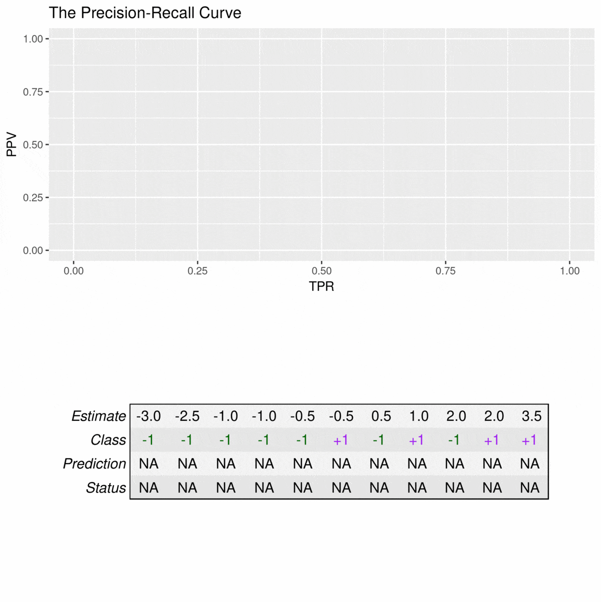
Note that there is no value for a TPR of 0% because the PPV is not defined when the denominator (TP + FP) is zero. For the first plotted point, the PPV is still at 100% because, at this cutoff, the model does not make any false alarms. However, to reach a sensitivity of 50%, the precision of the model is reduced to \(\frac{2}{3} = 66.5\) since a false positive prediction is made.
In the following, I will demonstrate how the area under the precision-recall curve (AUC-PR) is influenced by the predictive performance.
AUC-PR for a perfect classifier
An ideal classifier does not make any prediction errors. Thus, it will obtain an AUC-PR of 1:
set.seed(12345)
# create binary labels
y <- c(rep(0, 70), rep(1, 30))
# simulate scoring classifier
y.hat <- c(rnorm(70, -2, sd = 0.5), rnorm(30, 2, sd = 0.5))
plot.scores.AUC(y, y.hat, "ppv", "tpr")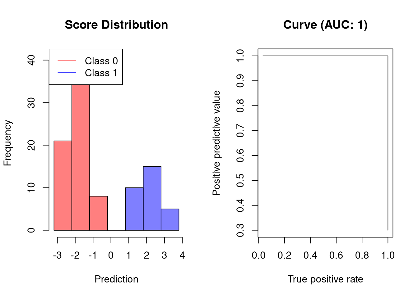
AUC-PR of a good classifier
A classifier that separates the two classes well but not perfectly would have the following precision-recall curve:
set.seed(12345)
# create binary labels
y <- c(rep(0, 70), rep(1, 30))
# simulate scoring classifier
y.hat <- c(rnorm(70, -1, sd = 1), rnorm(30, 1, sd = 1.25))
plot.scores.AUC(y, y.hat, "ppv", "tpr")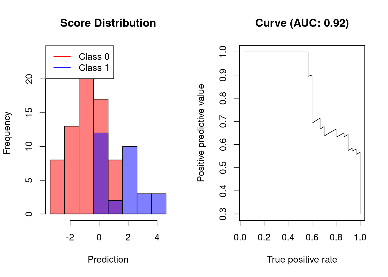
The visualized classifier reaches a recall of roughly 50% without any false posiive predictions.
AUC-PR of a bad classifier
A bad classifier will output scores whose values are only slightly associated with the outcome. Such a classifier will reach a high recall only at a low precision:
set.seed(12345)
# create binary labels
y <- c(rep(0, 70), rep(1, 30))
# simulate scoring classifier
y.hat <- c(rnorm(70, -0.5, sd = 1.75), rnorm(30, 0.5, sd = 1.25))
plot.scores.AUC(y, y.hat, "ppv", "tpr")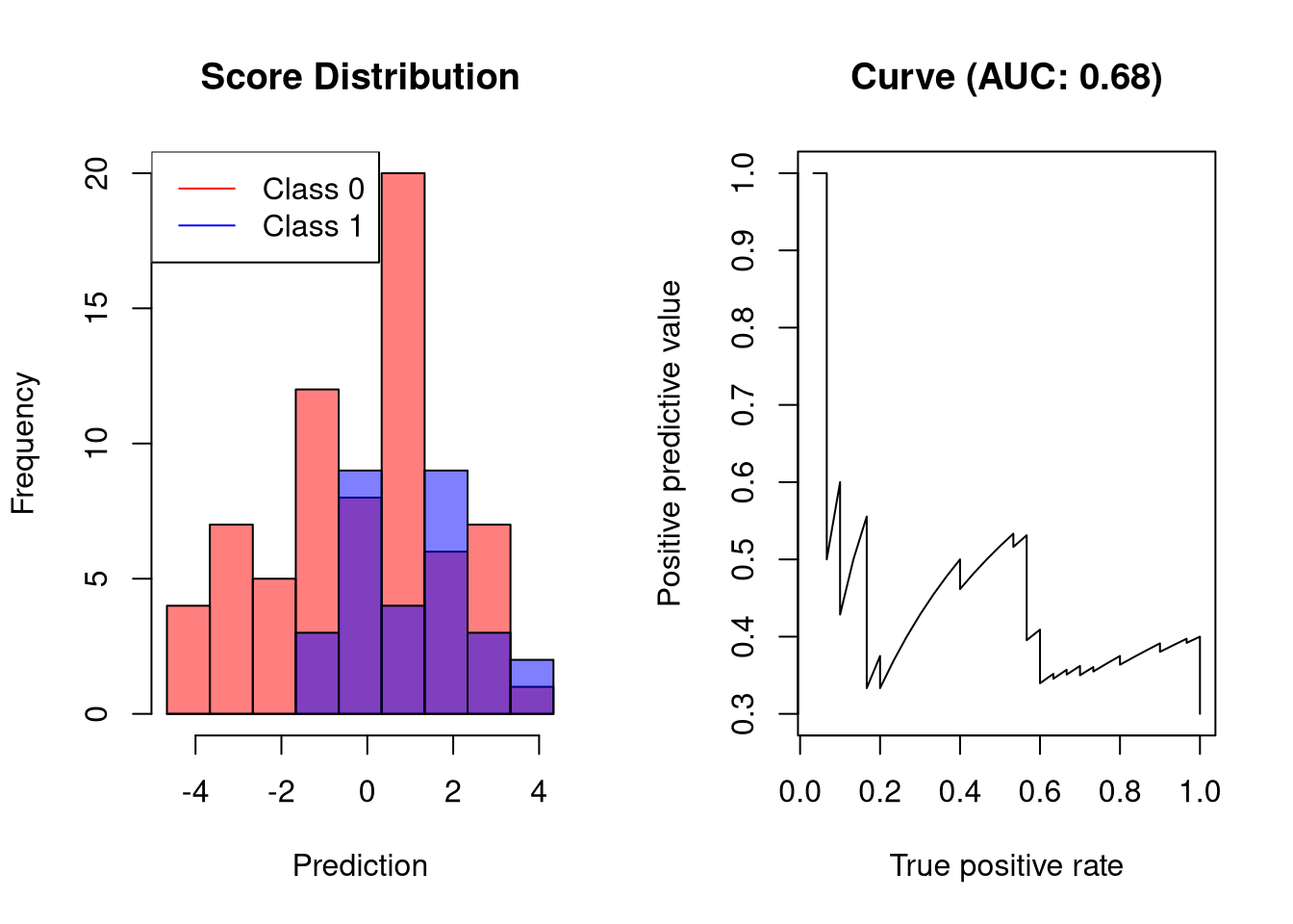
At a recall of only 20% the precision of the classifier is merely at 60%.
AUC-PR of a random classifier
A random classifier has an AUC-PR close to 0.5. This is easy to understand: for every correct prediction, the next prediction will be incorrect.
set.seed(12345)
# create binary labels
y <- c(rep(0, 70), rep(1, 30))
# simulate scoring classifier
y.hat <- c(rnorm(70, 0, sd = 2), rnorm(30, 0, sd = 2))
plot.scores.AUC(y, y.hat, "ppv", "tpr")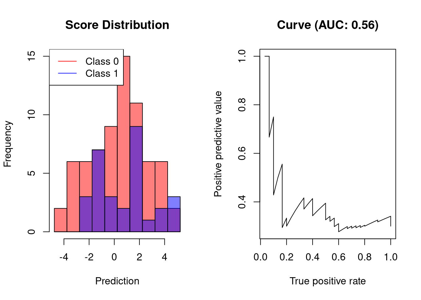
AUC-PR of classifiers that perform worse than random classifiers
Simlarly to the AUC of ROC curves, AUC-PR is typically in the range \([0.5, 1]\). If a classifier obtain an AUC-PR smaller than 0.5, the labels should be controlled. Such a classifier could have a precision-recall curve as follows:
set.seed(12345)
# create binary labels
y <- c(rep(0, 70), rep(1, 30))
# simulate scoring classifier
y.hat <- c(rnorm(70, 2, sd = 2), rnorm(30, -2, sd = 2))
plot.scores.AUC(y, y.hat, "ppv", "tpr")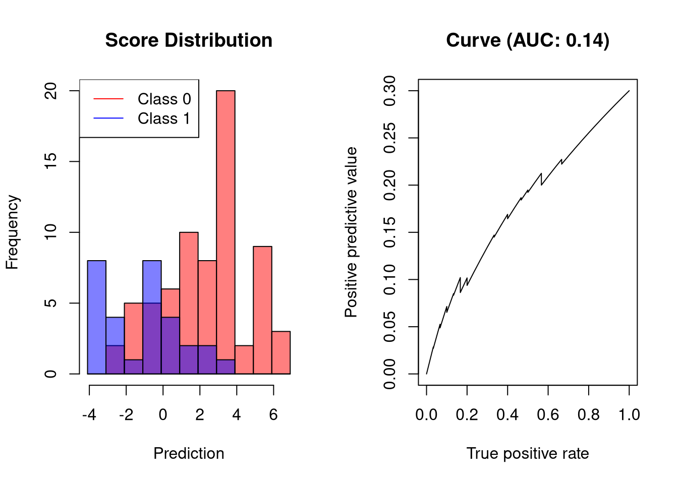
Further Reading
If you would like to learn more about the differences between performance measures such as the F1 Score and the ROC AUC, be sure to check out this article about common metrics for binary classification.
For classification problems where there are more than two labels, please consider a previous article in which I discussed ROC-based approaches in the multi-class setting.


Comments
There aren't any comments yet. Be the first to comment!