Performance Measures for Model Selection
There are several performance measures for describing the quality of a machine learning model. However, the question is, which is the right measure for which problem? Here, I discuss the most important performance measures for selecting regression and classification models. Note that the performance measures introduced here should not be used for feature selection as they do not take model complexity into account.
Performance measures for regression
For models that are based on the same set of features, RMSE and \(R^2\) are typically used for model selection.
The mean-squared error
The mean-squared error is determined by the residual sum of squares resulting from comparing the predictions \(\hat{y}\) with the observed outcomes \(y\):
\[MSE = \sum_{i=1}^N (y_i - \hat{y}_i)^2 \]
Since the MSE is based on squared residuals, it is on the scale of the squared outcomes. Thus, the root of the MSE, which is on the scale of the outcome, is often used to report model fit:
\[RMSE = \sqrt{MSE} \]
A disadvantage of the mean-squared error is that it is not very interpretable because MSEs vary depending on the prediction task and thus cannot be compared across different tasks. Assume, for example, that one prediction task is concerned with estimating the weight of trucks and another is concerned with estimating the weight of apples. Then, in the first task, a good model may have an RMSE of 100 kg, while a good model for the second task may have an RMSE of 0,5 kg. Therefore, while RMSE is viable for model selection, it is rarely reported and \(R^2\) is used instead.
Pearson’s correlation coefficient
Since the coefficient of determination can be interpreted in terms of Pearson’s correlation coefficient, we will introduce this quantity first. Let \(\hat{Y}\) indicate the model estimates and \(Y\) the observed outcomes. Then, the correlation coefficient is defined as
\[\rho_{\hat{Y}, Y} = \frac{\text{Cov}(\hat{Y}, Y)}{\sigma_{\hat{Y}} \sigma_Y} \]
where \(\text{Cov}(\cdot,\cdot) \in \mathbb{R}\) is the covariance and \(\sigma\) is the standard deviation. The covariance is defined as
\[\text{Cov}(\hat{Y}, Y) = E[ (\hat{Y} - \mu_{\hat{Y}}) (Y - \mu_Y)] \]
where \(\mu\) indicates the mean. In discrete settings, this can be computed as
\[\text{Cov}(\hat{Y}, Y) = \sum_{i=1}^N (\hat{y}_i - \bar{\hat{y}}) (y_i - \bar{y})\,.\]
This means that the covariance of predictions and outcomes will be positive if they exhibit similar deviations from the mean and negative if they exhibit contrasting deviations from the mean.
The standard deviation is defined as
\[\sigma_Y = \sqrt{\text{Var}(Y)} = \sqrt{E[(Y - \mu_Y)^2}]\,,\]
which, in discrete settings, can be computed as
\[\sigma_Y = \sqrt{\frac{1}{N} \sum_{i = 1}^N (y_i - \bar{y})^2}\,. \]
Note that the R function sd computes the population standard deviation, which uses \(\frac{1}{N-1}\) to obtain an unbiased estimator. \(\sigma\) is high if the distribution is wide (wide spread around the mean) and \(\sigma\) is small if the distribution is narrow (little spread around the mean).
Intuition for correlations: covariance and standard deviations
To understand covariance better, we create a function that plots the deviation of measurements from the mean:
plot.mean.deviation <- function(y, y.hat, label) {
    means <- c(mean(y), mean(y.hat))
    y.deviation <- y - mean(y)
    y.hat.deviation <- y.hat - mean(y.hat)
    prod <- y.deviation * y.hat.deviation
    df <- data.frame("N" = c(seq_along(y), seq_along(y)),
                     "Deviation" = c(y.deviation, y.hat.deviation),
                     "Variable" = c(rep("Y", length(y)),
                                   rep("Y_Hat", length(y.hat))))
    pos.neg <- ifelse(sign(prod) >= 0, "Positive", "Negative")
    segment.df <- data.frame("N" = c(seq_along(y), seq_along(y)),
                             "Y" = y.deviation, "Yend" = y.hat.deviation,
                             "Sign" = pos.neg, "Contribution" = prod)
    library(ggplot2)
    covariance <- round(cov(y, y.hat), 2)
    correlation <- round(cor(y, y.hat), 2)
    title <- paste0(label, " (Cov: ", covariance, ", Cor: ", correlation, ")")
    ggplot() +
        geom_segment(size = 2, data = segment.df,
                    aes(x = N, xend = N, y = Y, yend = Yend, color = Contribution))  +
        geom_point(data = df, alpha = 0.8, size = 2,
                          aes(x = N, y = Deviation, shape = Variable)) +
            xlab("Measurement i of N") + ylab("Deviation from mean value") +
            ggtitle(title) +
     scale_color_gradient2(mid = "grey60") +
     scale_shape_manual(values = 15:16,
        label = c(expression(Y), expression(hat(Y))))
}
We then generate data representing three types of covariance: positive covariance, negative covariance, and no covariance:
# covariance
set.seed(1501)
N <- 50
y <- rnorm(N)
set.seed(1001)
# high covariance: similar spread around mean
y.hat <- y + runif(N, -1, 1)
df.low <- data.frame(Y = y, Y_Hat = y.hat)
p1 <- plot.mean.deviation(y, y.hat, label = "Positive Covariance")
# negative covariance: contrasting spread around mean
y.mean <- mean(y)
noise <- rnorm(N, sd = 0.5)
y.hat <- y - 2 * (y - y.mean) + noise
p2 <- plot.mean.deviation(y, y.hat, "Negative Covariance")
# no covariance
y.hat <- runif(N, -0.1, 0.1)
df.no <- data.frame(Y = y, Y_Hat = y.hat)
p3 <- plot.mean.deviation(y, y.hat, "No Covariance")
library(gridExtra)
grid.arrange(p1, p2, p3, nrow = 3)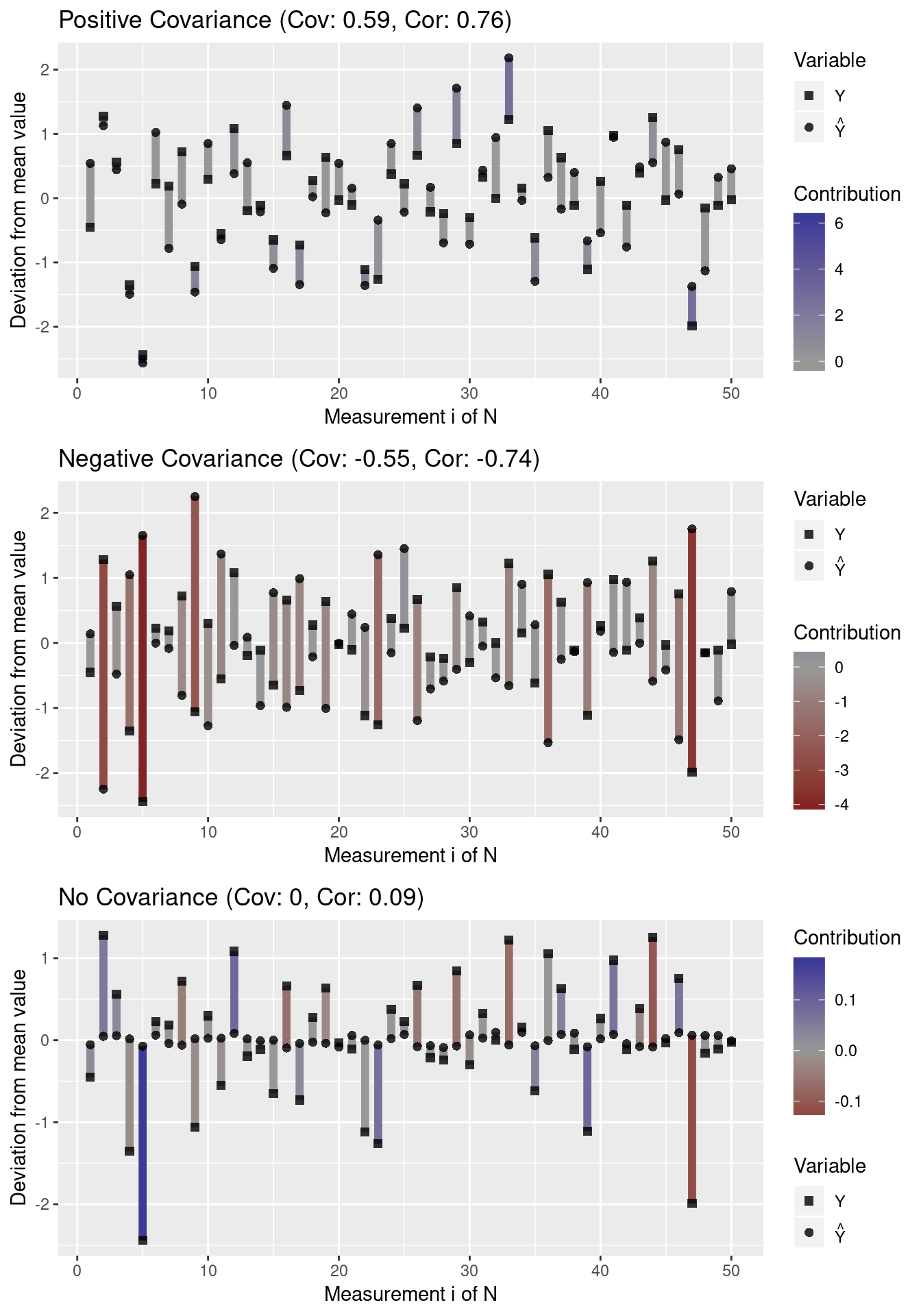
Note that outliers (high deviations from the mean) have a greater impact on the covariance than values close to the mean. Moreover, note that a covariance close to 0 indicates that there does not seem to be an association between variables in any direction (i.e. individual contribution terms cancel out).
Since the covariance depends on the spread of the data, the absolute covariance between two variables with high standard deviations is typically higher than the absolute covariance between variables with low variance. Let us visualize this property:
# high variance data
y <- rnorm(N, sd = 10)
y.hat <- y + runif(N, -10, 10)
plot.mean.deviation(y, y.hat, label = "Positive Covariance")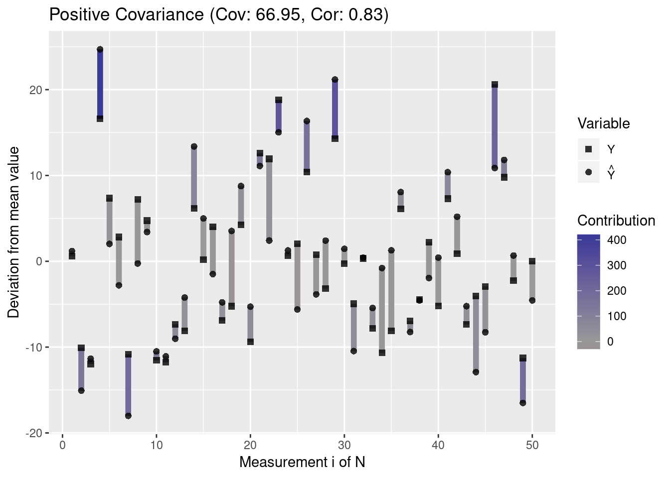
df.high <- data.frame(Y = y, Y_Hat = y.hat)Thus, the covariance by itself does not allow conclusions about the correlation of two variables. This is why Pearson’s correlation coefficient normalizes the covariance by the standard deviations of the two variables. Since this standardizes correlations to the range \([-1,1]\), this makes correlations comparable even though the variables have different variances. A value of -1 indicates a perfect negative correlation and a value of 1 indicates a perfect positive correlation, while a value of 0 indicates no correlation.
The coefficient of determination
The coefficient of determination, \(R^2\), is defined as
\[R^2 = 1- \frac{SS_{\rm {res}}}{SS_{\rm {tot}}}\,\]
where \(SS_{\rm{res}} = \sum_{i=1}^N (y_i - \hat{y}_i)^2\) is the residual sum of squares and \(SS_{\rm{tot}} = \sum_{i=1}^N (y_i - \bar{y})^2\) is the total sum of squares. For model selection, \(R^2\) is equivalent to the RMSE because for models based on the same data, the model with minimal MSE will also have the maximal value of \(R^2\) since \(SS_{\rm{res}}\) is in the enumerator of \(R^2\).
The coefficient of determination can be interpreted in terms of the correlation coefficient or in terms of the explained variance.
Interpretation in terms of the correlation coefficient
R squared is usually positive since models with an intercept produce predictions \(\hat{Y}\) with \(SS_{\rm{res}} < SS_{\rm{tot}}\) because the predictions of the model are closer to the outcomes than the mean outcome. So, as long as an intercept is present, the coefficient of determination is the square of the correlation coefficient:
\[R^2 = \rho_{\hat{Y}, Y}^2\,.\]
Interpretation in terms of explained variance
In cases where the total sum of squares decomposes into residual and regression sum of squares, \(SS_{\text{reg}}=\sum _{i}^N(\hat{y}_{i}-{\bar {y}})^{2}\), such that
\[SS_{\text{res}} + SS_{\text{reg}} = SS_{\text{tot}}\,,\]
then
\[R^{2}={\frac {SS_{\text{reg}}}{SS_{\text{tot}}}}\,.\]
This means that \(R^2\) indicates the ratio of variance that is explained by the model. Therefore, a model with \(R^2 = 0.7\) would explain \(70\%\) of the variance, leaving \(30\%\) of the variance unexplained.
Intuition for the coefficient of determination
To obtain an intuition about \(R^2\), we define the following functions with which we can plot the fit of a linear model. The ideal model would lie on a diagonal through the plot and the residuals are indicated as the deviations from this diagonal.
rsquared <- function(test.preds, test.labels) {
    return(round(cor(test.preds, test.labels)^2, 3))
}
plot.linear.model <- function(model, test.preds = NULL, test.labels = NULL,
                            test.only = FALSE) {
    # ensure that model is interpreted as a GLM
    pred <- model$fitted.values
    obs <- model$model[,1]
    if (test.only) {
        # plot only the results for the test set
        plot.df <- NULL
        plot.res.df <- NULL
    } else {
        plot.df <- data.frame("Prediction" = pred, "Outcome" = obs,
                                "DataSet" = "training")
        model.residuals <- obs - pred
        plot.res.df <- data.frame("x" = obs, "y" = pred,
                        "x1" = obs, "y2" = pred + model.residuals,
                        "DataSet" = "training")
    }
    r.squared <- NULL
    if (!is.null(test.preds) && !is.null(test.labels)) {
        # store predicted points:
        test.df <- data.frame("Prediction" = test.preds,
                            "Outcome" = test.labels, "DataSet" = "test")
        # store residuals for predictions on the test data
        test.residuals <- test.labels - test.preds
        test.res.df <- data.frame("x" = test.labels, "y" = test.preds,
                        "x1" = test.labels, "y2" = test.preds + test.residuals,
                         "DataSet" = "test")
        # append to existing data
        plot.df <- rbind(plot.df, test.df)
        plot.res.df <- rbind(plot.res.df, test.res.df)
        # annotate model with R^2 value
        r.squared <- rsquared(test.preds, test.labels)
    }
    #######
    library(ggplot2)
    p <- ggplot() +
        # plot training samples
        geom_point(data = plot.df,
            aes(x = Outcome, y = Prediction, color = DataSet)) +
        # plot residuals
        geom_segment(data = plot.res.df, alpha = 0.2,
            aes(x = x, y = y, xend = x1, yend = y2, group = DataSet)) +
        # plot optimal regressor
        geom_abline(color = "red", slope = 1)
    if (!is.null(r.squared)) {
        # plot r squared of predictions
        max.val <- max(plot.df$Outcome, plot.df$Prediction)
        x.pos <- 0.2 * max.val
        y.pos <- 0.9 * max.val
        label <- paste0("R^2: ", r.squared)
        p <- p + annotate("text", x = x.pos, y = y.pos, label = label, size = 5)
    }
    return(p)
}
For example, compare the following models
model <- lm(Y ~ Y_Hat, data = df.low)
plot.linear.model(model) 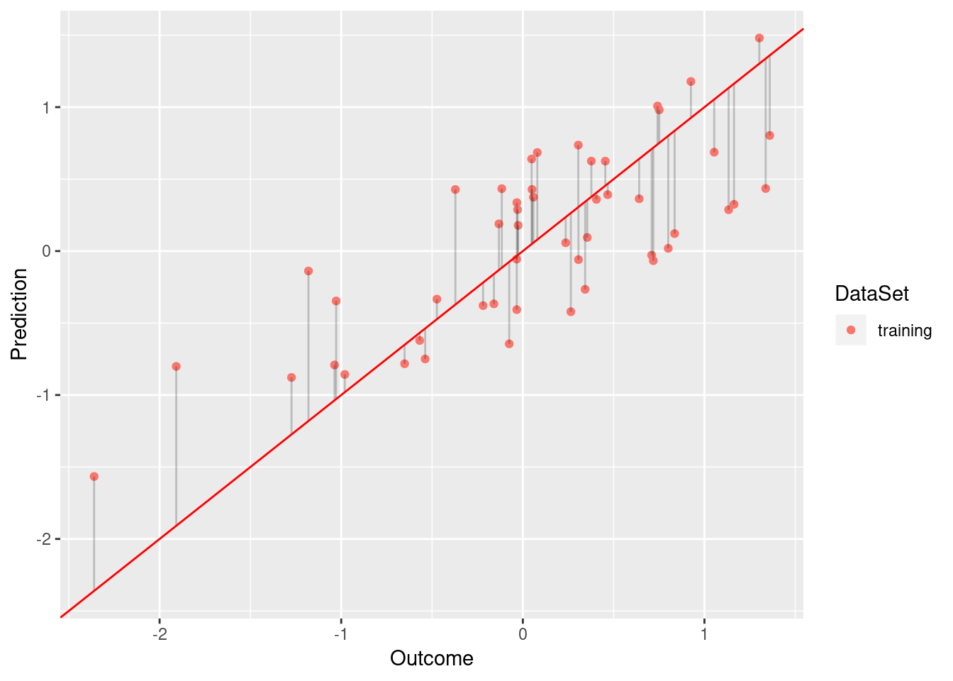
model <- lm(Y ~ Y_Hat, data = df.no)
plot.linear.model(model)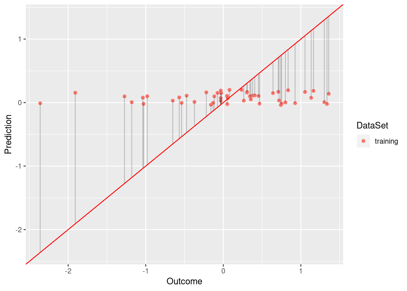
While the model based on df.low has a sufficient fit (R squared of 0.584), df.low does not fit the data well (R squared of 0.009).
Limitations of R squared
Blindly selecting a model solely based on R squared is usually a bad idea. First, R squared does not necessarily tell us something about goodness of fit. For example, consider data with an exponential distribution:
x <- rexp(50,rate=0.005)  # exponential
y <- (x + 2.5)^2 * runif(50, min=0.8, max=2) # non-linear relationship with x
plot(x,y) 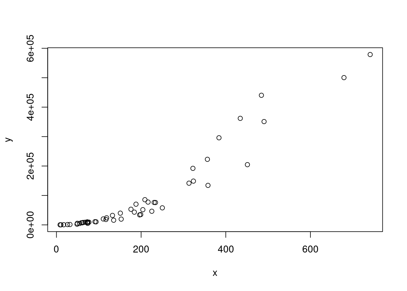
Let us compute \(R^2\) for a linear model fitted on these data:
df <- data.frame("x" = x, "y" = y)
model <- lm(x ~ y, data = df)
print(round(summary(model)$r.squared, 2))
## [1] 0.9As we can see, R squared is very high. Still, the model does not fit well because it does not respect the exponential distribution of the data.
Another property of \(R^2\) is that it depends on the value range. \(R^2\) is typically larger for wide value ranges of \(X\) because the increase in covariance is adjusted by the standard deviation, which scales more slowly than the covariance due to the \(\frac{1}{N}\) term.
# wide value range:
x <- seq(1,10,length.out = 100)
y <- 2 + 1.2*x + rnorm(100,0,sd = 0.9)
model <- lm(y ~ x)
mse <- sum((fitted(model) - y)^2)/100
print(paste0("R squared: ", summary(model)$r.squared,
        ", MSE:", mse))
## [1] "R squared: 0.924115453794893, MSE:0.806898017781999"# narrow value range
x <- seq(1,2,length.out = 100)
y <- 2 + 1.2*x + rnorm(100,0,sd = 0.9)
model <- lm(y ~ x)
mse <- sum((fitted(model) - y)^2)/100
print(paste0("R squared: ", summary(model)$r.squared,
", MSE:", mse))## [1] "R squared: 0.0657969487417489, MSE:0.776376454723889"As we can see, even though both models have similar residual sum of squares, the first model has a superior \(R^2\).
Performance measures for classification
Many performance measures for binary classification rely on the confusion matrix. Assume that there are two classes, \(0\) and \(1\), where \(1\) indicates the presence of a trait (the positive class) and \(0\) the absence of a trait (the negative class). The corresponding confusion matrix is a \(2 \times 2\) table with the following structure:
| Prediction/Reference | 0 | 1 |
|---|---|---|
| 0 | TN | FN |
| 1 | FP | TP |
where TN indicates the number of true negatives (model predicts negative class correctly), FN indicates the number of false negatives (model incorrectly predicts negative class), FP indicates the number of false positives (model incorrectly predicts positive class), and TP indicates the number of true positives (model correctly predicts positive class).
Accuracy vs sensitivity and specificity
Based on the confusion matrix, accuracy, sensitivity (true positive rate, TPR) and specificity (1 - false positive rate, FPR) can be computed:
\[\begin{align*} \text{accuracy} &= \frac{TP + TN}{FP + TP + FN + TN} \\ \text{sensitivity} &= TPR = \frac{TP}{TP + FN} \\ \text{specificity} &= 1 - FPR = 1 - \frac{FP}{FP + TN} \\ \end{align*}\]
Accuracy indicates the overall ratio of correct predictions. Accuracy has a bad reputation because it is unsuitable if the class labels are imbalanced. For example, imagine you want to predict the presence of rare tumors (class 1) versus their absence (class 0). Let us assume that only 10% of the data points belong to the positive class and 90% belong to the positive class. What would be the accuracy of a classifer that always predicts the negative class (i.e. that no tumor was found)? It would be 90%. However, this is probably not a very helpful classifier. Therefore, sensitivity and specificity are usually preferred over mere accuracy.
Sensitivity indicates the ratio of observed positive outcomes that were correctly predicted, while specificity indicates the ratio of observed negative outcomes that were confused with the positive class. These two quantities answer the following questions:
- Sensitivity: If an event happens, how likely is it that the model detects the event?
- Specificity: If no event happens, how likely is it that the model identifies that no event occurred?
We always need to consider sensitivity and specificity together because, on their own, these quantities are not useful for model selection. For example, a model that always predicts the positive class would maximize sensitivity, while a model that always predicts the negative class would maximize specificity. However, the first model would suffer from low specificity, while the second model would suffer from low sensitivity. Thus, sensitivity and specificity can be interpreted as a seesaw since increases in sensitivity typically lead to decreases in specificity, and vice versa.
Sensitivity and specificity can be combined into a single quantity by computing the balanced accuracy, which is defined as
[ = \,.]
The balanced accuracy is a more suitable measure for problems in which the classes are imbalanced.
The area under the receiver operating characteristic curve
Scoring classifiers are classifiers that assign a numeric value to every prediction, which can be used as a cutoff for differentiating the two classes. For example, binary support vector machines would assign values greater than 1 to the positive class and values less than -1 to the negative class. For scoring classifiers, we typically want to determine model performance not for a single cutoff but for many cutoffs.
This is where the AUC (area under the receiver operating characteristic curve) comes in. This quantity indicates the trade-off between sensitivity and specificity for several cutoffs. This is because the receiver operating characteristic (ROC) curve is simply a plot of TPR vs FPR and the AUC is the area defined by this curve, which is in the range [0, and the AUC is the area defined by this curve, which is in the range [0,1].
Using R, we can compute AUCs using the ROCR package. Let us first create a function for plotting the scores of a classifier as well as its AUC:
plot.scores.AUC <- function(y, y.hat) {
    par(mfrow=c(1,2))
    hist(y.hat[y == 0], col=rgb(1,0,0,0.5),
         main = "Score Distribution",
         breaks=seq(min(y.hat),max(y.hat)+1, 1), xlab = "Prediction")
    hist(y.hat[y == 1], col = rgb(0,0,1,0.5), add=T,
            breaks=seq(min(y.hat),max(y.hat) + 1, 1))
    legend("topleft", legend = c("Class 0", "Class 1"),  col=c("red", "blue"), lty=1, cex=1)
    # plot ROC curve
    library(ROCR)
    pr <- prediction(y.hat, y)
    prf <- performance(pr, measure = "tpr", x.measure = "fpr")
    # get AUC
    auc <- performance(pr, measure = "auc")@y.values[[1]]
    plot(prf, main = paste0("ROC Curve (AUC: ", round(auc, 2), ")"))
}
Using the plot, we can now demonstrate how the AUC behaves when the scores of a classifier allow for perfect separation and when this is not the case.
# create binary labels
y <- c(rep(0, 50), rep(1, 50))
# simulate scoring classifier with two separated Gaussians
y.hat <- c(rnorm(50, -2, sd = 1), rnorm(50, 2, sd = 0.75))
plot.scores.AUC(y, y.hat)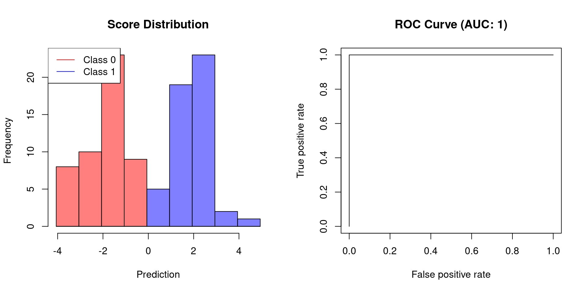
# create slightly overlapping Gaussians
y.hat <- c(rnorm(50, -1, sd = 2), rnorm(50, 1, sd = 3))
plot.scores.AUC(y, y.hat)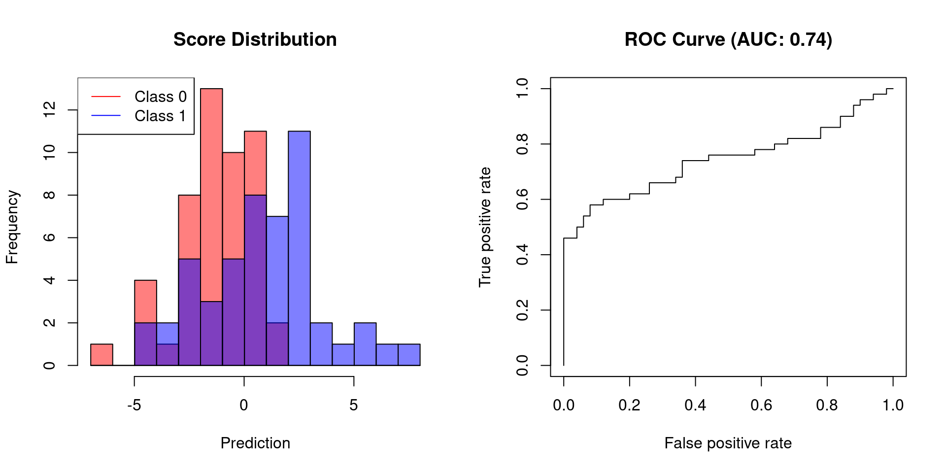
The first example shows that a classifier, which allows for perfect separation, has an AUC of 1. Classifiers that do not afford perfect separation need to sacrifice specificity to increase their sensitivity. Thus, their AUC will be less than 1.


Comments
There aren't any comments yet. Be the first to comment!