An Introduction to Forecasting
Forecasting is concerned with making predictions about future observations by relying on past measurements. In this article, I will give an introduction how ARMA, ARIMA (Box-Jenkins), SARIMA, and ARIMAX models can be used for forecasting given time-series data.
Preliminaries
Before we can talk about models for time-series data, we have to introduce two concepts.
The backshift operator
Given the time series \(y = \{y_1, y_2, \ldots \}\), the backshift operator (also called lag operator) is defined as
\[B y_t = y_{t-1}\,, \forall t > 1\,.\]
One application of the backshift operator yields the previous measurement in the time series. Raising the backshift operator to a power \(k > 0\) performs multiple shifts at once:
\[ \begin{align*} B^k y_t &= y_{t-k} \\ B^{-k} y& = y_{t+k} \end{align*} \]
For example \(B^2 y_t\) yields the measurement that was observed two time periods earlier. Instead of \(B\), \(L\) is used equivalently to indicate the lag operator.
Calculating lagged differences with the backshift operator
We can use the backshift operator to perform calculations. For example, the backshift operator can be used to calculate lagged differences for a time-series of values \(y\) via \(y_i - B^k(y_i)\,,\forall i \in {k+1, \ldots, t}\) where \(k\) indicates the lag of the differences. For \(k = 1\), we obtain ordinary pairwise differences, while for \(k = 2\) we obtain the pairwise differences with respect to the pre-predecessor. Let us consider an example in R.
Using R, we can calculate lagged differences using the diff function. The second argument of the function indicates the desired lag, \(k\), which is set to \(k = 1\) by default. For example:
y <- c(1,3,5,10,20)
By <- diff(y) # y_i - B y_i
B3y <- diff(y, 3) # y_i - B^3 y_i
message(paste0("y is: ", paste(y, collapse = ","), "\n",
        "By is: ", paste(By, collapse = ","), "\n",
        "B^3y is: ", paste(B3y, collapse = ",")))
## y is: 1,3,5,10,20
## By is: 2,2,5,10
## B^3y is: 9,17By stores the result of \(y_i - B(y_i)\), while B3y stores the result of \(y_i - B^3(y_i)\).
The autocorrelation function
The autocorrelation function (ACF) defines the correlation of a variable \(y_t\) to previous measurements \(y_{t-1}, \ldots, t_1\) of the same variable (hence the name autocorrelation). To determine the ACF, correlations are calculated for lagged vectors of observations, \(y_t\) and \(y_{t-k}\). Here, \(k \geq 0\) indicates the lag. For example, for the previous vector \(y = \begin{pmatrix}1 & 3 & 5 & 10 & 20\end{pmatrix}^T\), for \(k = 1\), we would have
\[ \begin{align*} y_t &= \begin{pmatrix}3 & 5 & 10 & 20\end{pmatrix}^T \\ y_{t-1} &= \begin{pmatrix}1 & 3 & 5 & 10\end{pmatrix}^T \end{align*} \]
The autocorrelation for lag \(k\) is defined as:
\[\varphi_{k}:=\operatorname {Corr} (y_{t},y_{t-k})\quad k=0,1,2,\cdots\,.\]
To compute the autocorrelation, we can use the following R function:
get_autocor <- function(x, lag) {
    x.left <- x[1:(length(x) - lag)]
    x.right <- x[(1+lag):(length(x))]
    autocor <- cor(x.left, x.right)
    return(autocor)
}
The function simply constructs the two vectors, \(y_t\) and \(y_{t-k}\) according to the lag parameter and then calculates their correlation. When we apply this example to our example, we receive the following results:
# correlation of measurements 1 time point apart (lag 1)
get_autocor(y, 1)
## [1] 0.9944627# correlation of measurements 2 time points apart (lag 2)
get_autocor(y, 2)## [1] 0.9819805The high autocorrelations of the data demonstrate that the data have a clear time trend.
Partial autocorrelations
Since the autocorrelation observed for greater lags can be the results of correlations at lower lags, it is often worthwhile to consider partial autocorrelation function (pACF). The idea of the pACF is to compute partial correlations, which condition the correlation on more recent observations of the variable. The pACF is defined as:
\[\varphi_{kk}:=\operatorname {Corr} (y_{t},y_{t-k}|y_{t-1},\cdots ,y_{t-k+1})\quad k=0,1,2,\cdots\]
Using the pACF it is possible to identify whether there are actual lagged autocorrelations or whether these autocorrelations are caused by other measurements.
The simplest way to compute and plot the ACF and the pACF is the use of the acf and pacf functions, respectively:
par(mfrow = c(1,2))
acf(y) # conventional ACF
pacf(y) # pACF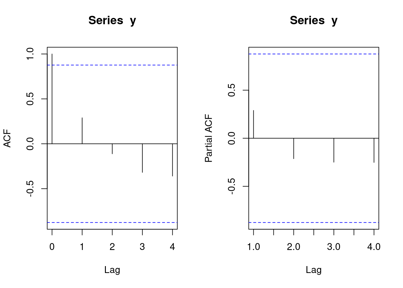
In ACF visualizations, the ACF or pACF is plotted as a function of the lag. The indicated horizontal, dashed blue lines indicate the levels at which the autocorrelation is significant.
Decomposing time-series data
To interpret time-series data, it is useful to decompose the observations \(y_t\) into three components:
- Seasonality \(S_t\): seasonal trends (e.g. gym memberships rise at the start of the new year)
- Trend \(T_t\): overall trends (e.g. the global temperature is increasing)
- Error \(\epsilon_t\): unexplained noise (the less the better for a time-series model to be valid)
The manner in which the decomposition is performed depends on whether the time-series data are additive or multiplicative.
Additive and multiplicative time-series data
An additive model assumes that the data can be decomposed as
\[y_t = S_t + T_t + \epsilon_t\,.\]
On the other hand, a multiplicative model assumes that the data can be decomposed as
\[y_t = S_t T_t \epsilon_t\,.\]
To obtain a multiplicative model, we can simply take the logarithm of the \(y_t\). The main differences between additive and multiplicative time-series is the following:
- Additive: amplitutdes of seasonal effects are similar in each period.
- Multiplicative: seasonal trend changes with the progression of the time series.
An example for a multiplicative time series is provided by the AirPassengers data set.
data(AirPassengers)
plot(AirPassengers)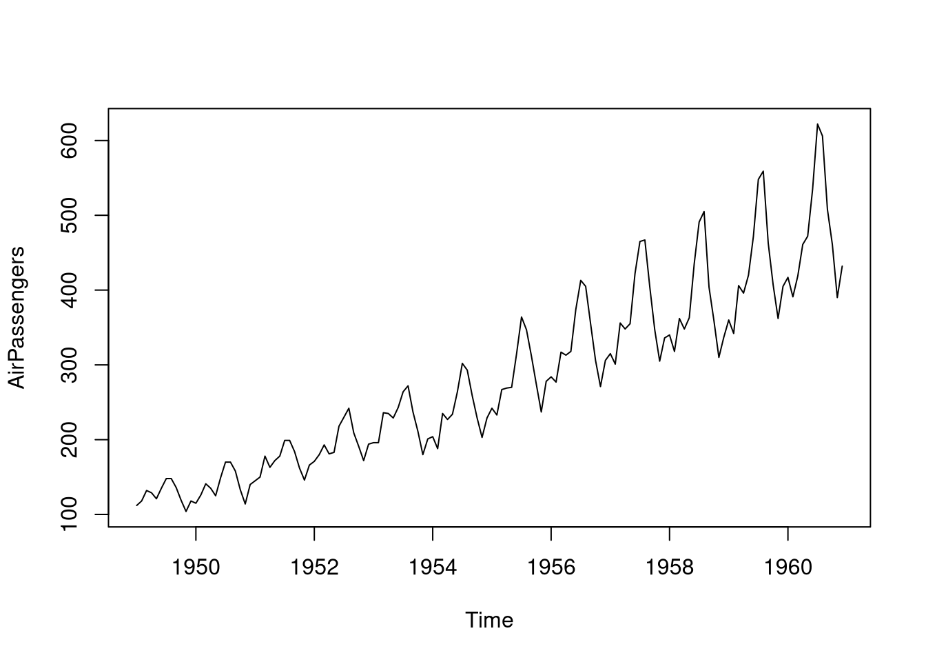
As we can see, the effect of the seasonal trend is increasing through the years (i.e. more airplane passengers in the summer), which indicates that this data is multiplicative. To adjust for this effect, we have to take the logarithm of the measurements when modeling this data because \(\log(S_t T_t \epsilon_t) = \log(S_t) + \log(T_t) + \log(\epsilon_t)\) turns the previously multiplicative model into an additive model. Let us verify whether taking the logarithm changes the seasonal trend in the AirPassengers data set:
plot(log(AirPassengers))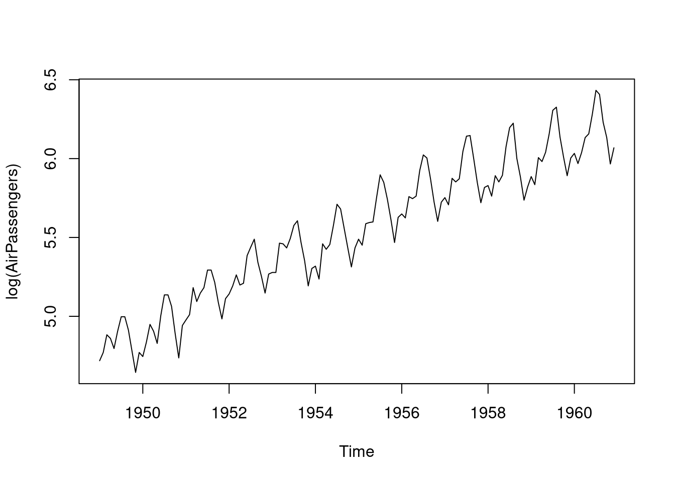
As we can see, taking the logarithm has equalized the amplitude of the seasonal component along time. Note that the overall increasing trend has not changed.
Decomposing time-series data in R
To decompose time-series data in R, we can use the decompose function. Note that we should provide whether the time series is additive or multiplicative via the type argument.
Example 1: AirPassengers data set
For the AirPassengers data set, we specify that the data are multiplicative and obtain the following decomposition:
plot(decompose(AirPassengers, type = "multiplicative"))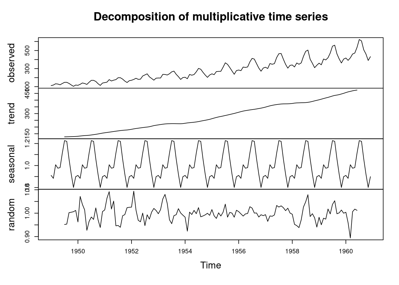
The decomposition demonstrates that the total number of airline passengers is increasing along the years. Moreover, the seasonal effect, which we have already observed before, is clearly captured.
Example 2: EuStockMarkets data set
Let us consider the decomposition that can be found for the EuStockMarkets data set:
daxData <- EuStockMarkets[, 1] # DAX data
# data do not seem to be multiplicative, use additive decomposition
decomposed <- decompose(daxData, type = "additive")
plot(decomposed)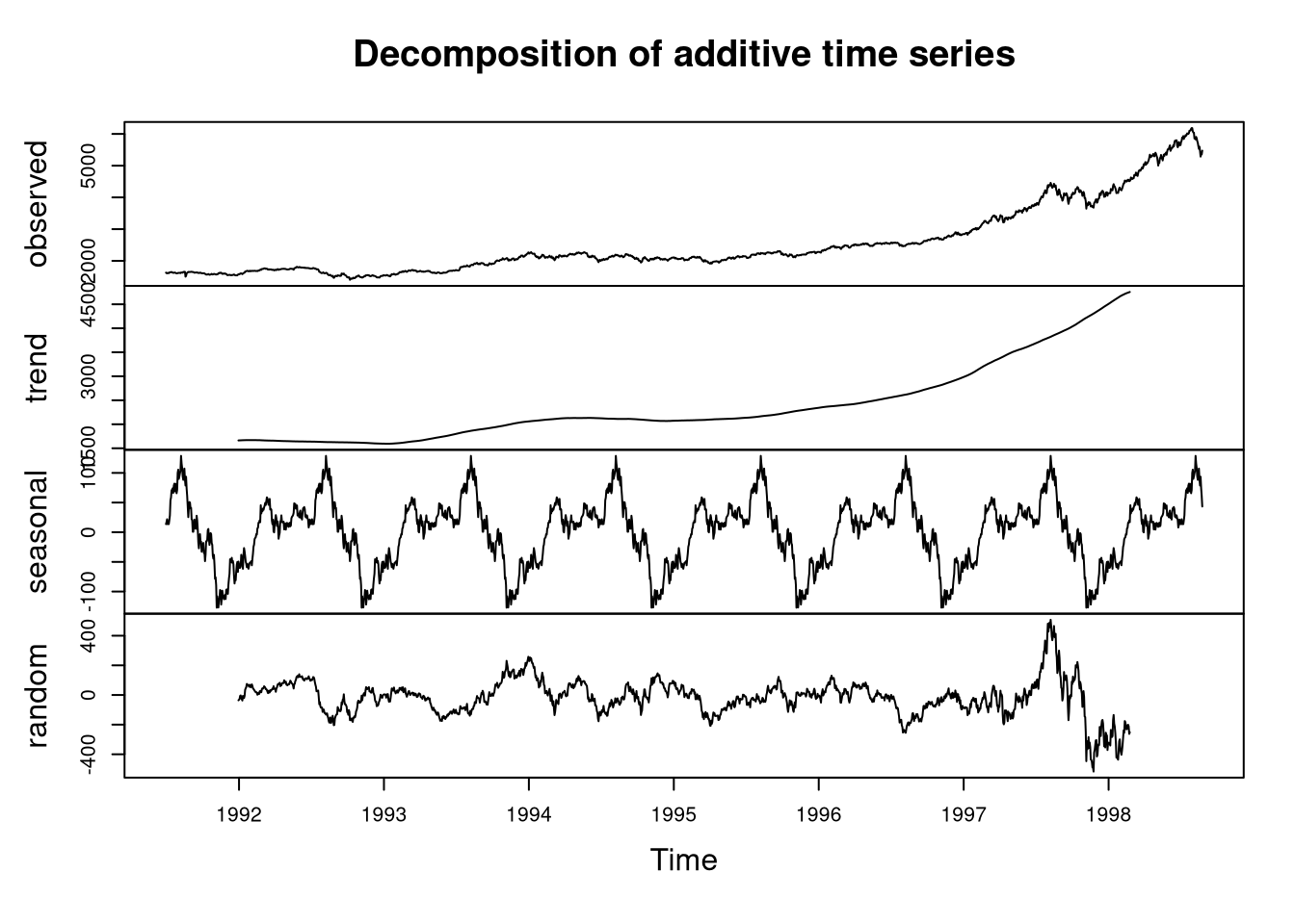
The plot demonstrates the following in the DAX data from 1992 to 1998:
- The overall value is increasing steadily.
- There is a strong seasonal trend: at the beginning of each year, the stock price is relatively low and reaches its relative maximum at the end of summer.
- The contribution of random noise is negligible, except for the final measurements between 1997 and 1998.
Stationary vs non-stationary processes
A process generating time-series data can be either stationary or non-stationary. A process is stationary if its mean and variance are not shifting along the timeline. For example, the EuStockMarkets and the AirPassengers data are both non-stationary because there is an increasing trend in the data. For a better intuition for differentiating stationary and non-stationary processes, consider the following example:
par(mfrow = c(1,2))
# climate data
library(tseries)
## Registered S3 method overwritten by 'quantmod':
## method from
## as.zoo.data.frame zoodata(nino)
x <- nino3.4
plot(x, main = "Stationary process")
# aircraft passenger data
plot(AirPassengers, main = "Non-stationary process")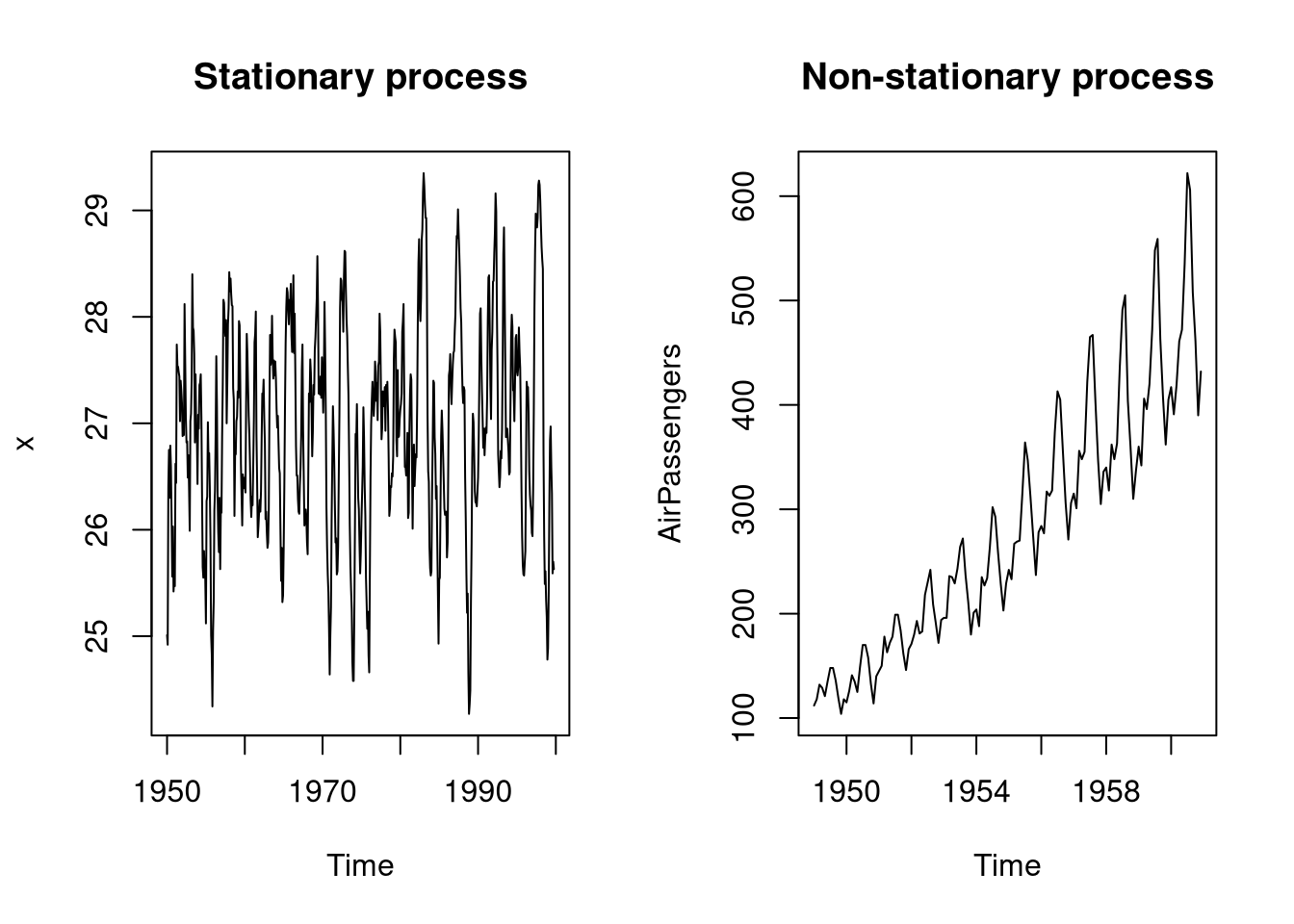
The left plot shows a stationary process in which the data behaves similarly throughout all measurements. The right plot shows a non-stationary process in which the mean value is increasing along time.
Having introduced the most important concepts relating to the analysis of time-series data, we can now start investigating models for forecasting.
The ARMA model
ARMA stands for autoregressive moving average. ARMA models are only appropriate for stationary processes and have two parameters:
- p: the order of the autoregressive (AR) model
- q: the order of the moving-average (MA) model
The ARMA model can be specified as
\[\hat{y}_t = c + \epsilon_t + \sum_{i=1}^p \phi_i y_{t-i} - \sum_{j=1}^q \theta_j \epsilon_{t-j}\,.\]
with the following variables:
- \(c\): the intercept of the model (e.g. the mean)
- \(\epsilon_t\): random error (white noise, residual) associated with measurement \(t\) with \(\epsilon_t \sim N(0, \sigma^2)\).
- \(\phi \in \mathbb{R}^p\): a vector of coefficients for the AR terms. In R, these parameters are called AR1, AR2, and so forth.
- \(y_t\): outcome measured at time \(t\)
- \(\theta \in \mathbb{R}^q\): a vector of coefficients for the MA terms. In R, these parameters are called MA1, MA2, and so forth.
- \(\epsilon_t\): noise associated with measurement \(t\)
Formulating the ARMA model using the backshift operator
Using the backshift operator, we can formulate the ARMA model in the following way:
\[\left(1 - \sum_{i=1}^p \phi_i B^i \right) y_t = \left(1 - \sum_{j=1}^q \theta_j B^j\right) \epsilon_j\]
By defining \(\phi_p(B) = 1 - \sum_{i=1}^p \phi_i B^i\) and \(\theta_q(B) = 1 - \sum_{j=1}^q \theta_j B^j\), the ARMA model simplifies to:
\[\phi_p(B) y_t = \theta_q(B) \epsilon_t\,.\]
The ARIMA model
ARIMA stands for autoregressive integrated moving average and is a generalization of the ARMA model. In contrast to ARMA models, ARIMA models are capable of dealing with non-stationary data, that is, time-series where the mean or the variance changes over time. This feature is indicated by the I (integrated) of ARIMA: an initial differencing step can eliminate the non-stationarity. For this purpose, ARIMA models require an additional parameter, \(d\), which defines the degree of differencing.
Taken together, an ARIMA model has the following three parameters:
- p: the order of the autoregressive (AR) model
- d: the degree of differencing
- q: the order of the moving-average (MA) model
In the ARIMA model, outcomes are transformed to differences by replacing \(y_t\) with differences of the form
\[(1 - B)^d y_t\,.\]
The model is then specified by
\[\phi_p(B)(1 - B)^d y_t = \theta_q(B) \epsilon_t\,. \]
For \(d = 0\), the model simplifies to the ARMA model since \((1 - B)^0 y_t = y_t\). For other choices of \(d\) we obtain backshift polynomials, for example:
\[ \begin{align*} (1-B)^1 y_t &= y_t - y_{t-1} \\ (1-B)^2 y_t &= (1 - 2B + B^2) y_t = y_t - 2 y_{t-1} + y_{t-2} \\ \end{align*} \]
In the following, let us consider the interpretation of the three parameters of ARIMA models.
The autoregressive model and \(p\)
The parameter \(p \in \mathbb{N}_0\) specifies the order of the autoregressive model. The term order refers to the number of lagged differences that the model considers. For simplicity, let us assume that \(d = 0\) (no differencing). Then, an AR model of order 1 considers only the most recent measurements, that is, \(B y_t = y_{t-1}\) via the parameter \(\phi_1\). An AR model of order 2, on the other hand, would consider the last two points in time, that is, measurements \(y_{t-1}\) as well as \(y_{t-2}\) through \(\phi_1\) and \(\phi_2\), respectively.
The number of autoregressive terms indicates the extent to which previous measurements influence the current outcome. For example, ARIMA(1,0,0), which has \(p =1\), \(d = 0\), and \(q = 0\), has an autoregressive term of order 1, which means that the outcome is influenced only by the most recent previous measurements. In this case, the model simplifies to
\[\hat{y}_t = \mu \epsilon_t + \phi_1 y_{t-1}\]
Impact of autoregression
We can simulate autoregressive processes using the arima.sim function. Via the function, the model can be specified by providing the coefficients for the MA and AR terms to be used. In the following we will plot the autocorrelation, because it is best-suited for finding the impact of autoregression.
set.seed(5)
par(mfrow = c(2, 2))
# Example for ARIMA(1,0,0)
x <- arima.sim(list(ar = 0.75),
                n = 1000)
plot(x, main = "ARIMA(1,0,0)")
# plot partial acf
acf(x, type = "partial", main = "Partial autocorrelation")
# Example for ARIMA(2,0,0)
x <- arima.sim(list(ar = c(0.65, 0.3)),
        n = 1000)
plot(x, main = "ARIMA(2,0,0)")
acf(x, type = "partial", main = "Partial autocorrelation")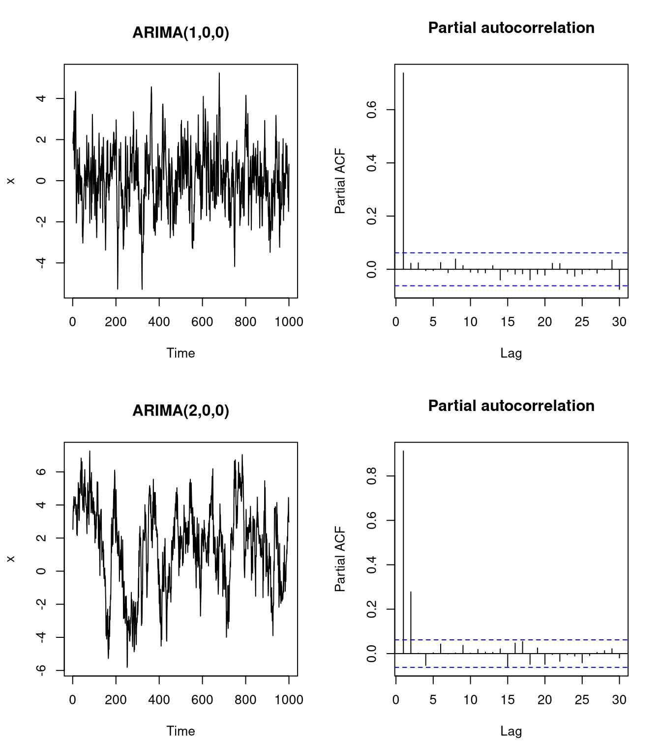
The first example demonstrates that for an ARIMA(1,0,0) process, the pACF for order 1 is exceedingly high, while for an ARIMA(2,0,0) process, both order 1 and order 2 autocorrelations are significant. Thus, the order of the AR term can be selected according to the largest lag at which the pACF was significant.
The degree of differencing and \(d\)
The parameter \(d \in \mathbb{N}_0\) specifies the degree of differencing in the model term \((1 - B)^d y_t\). In practice, \(d\) should be chosen such that we obtain a stationary process.
An ARIMA(0,1,0) model simplifies to the random walk model
\[\hat{y}_t = \mu + \epsilon_t + y_{t-1} \,.\]
This model is random because for every point in time \(t\), the mean is simply adjusted by \(y_{t-1}\), which leads to random changes of \(\hat{y}_t\) over time.
Impact of differencing
The following example demonstrates the impact of differencing for the AirPassengers data set:
par(mfrow = c(1, 2))
plot(AirPassengers, main = "Before differencing")
plot(diff(AirPassengers, 1), main = "After differencing")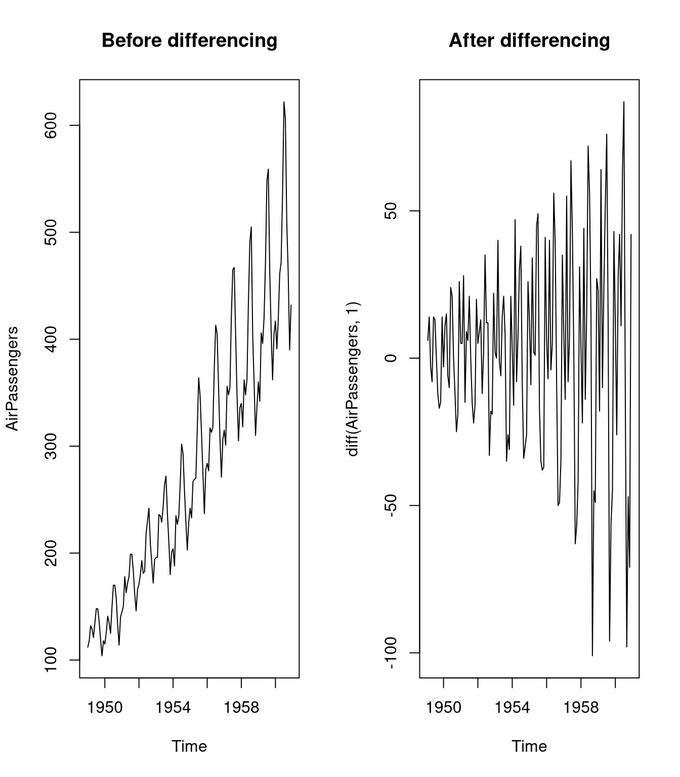
While the first plot demonstrates that the data is clearly non-stationary, the second plot, indicates that the differenced time series is rather stationary.
The moving-average model and \(q\)
The moving average model is specified via \(q \in \mathbb{N}_0\). The MA term models the past error, \(\epsilon_t\) using coefficients \(\theta\). An ARIMA(0,0,1) model simplifies to
\[\hat{y}_t = \mu + \epsilon_t + \theta_1 \epsilon_{t-1}\,,\]
in which the current estimate depends on the residual of the previous measurement.
Impact of the moving average
The impact of the moving average can be studied by plotting the autoregression function:
par(mfrow = c(2, 2))
# Example for ARIMA(0,0,1)
x <- arima.sim(list(ma = 0.75),
                n = 1000)
plot(x, main = "ARIMA(0,0,1)")
acf(x, main = "Autocorrelation")
# Example for ARIMA(0,0,2)
x <- arima.sim(list(ma = c(0.65, 0.3)),
        n = 1000)
plot(x, main = "ARIMA(0,0,2)")
acf(x, main = "Autocorrelation")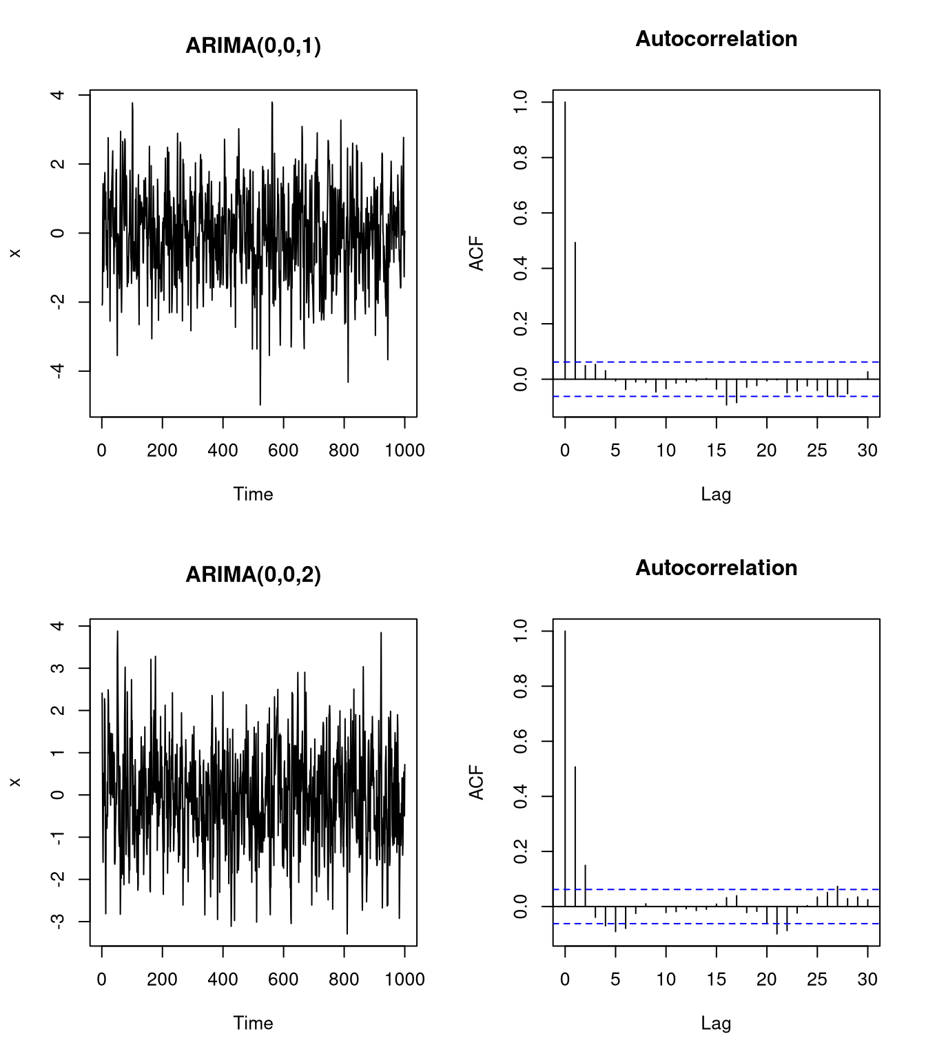
Note that for the autoregression plots, we need to be aware that the first x-axis position indicates a lag of 0 (i.e. the identity vector). In the first plot, only the autocorrelation at the first lag is significant, while the second plots indicates that the autocorrelation at the first two lags are significant. To find the number of MA terms, a similar rule as for AR terms applies: the order of the MA term corresponds to the largest lag at which the autocorrelation is significant.
Choosing between AR and MA terms
To decide which is more appropriate, AR or MA terms, we need to consider both the ACF (autocorrelation function) and PACF (partial ACF). Using these plots we can differentiate two signatures:
- AR signature: The PACF of the differenced time series displays a sharp cutoff or the value at lag 1 in the PACF is positive. The parameter \(p\) is determined by the lag at which the PACF cuts off (last significant autocorrelation).
- MA signature: commonly associated with a negative autocorrelation at lag 1 in the ACF of the differenced time series. The parameter \(r\) is determined by the lag at which the ACF cuts off (last significant autocorrelation).
Impact of AR and MA terms together
Combinations of AR and MA terms lead to the following time-series data:
par(mfrow = c(3, 3))
# ARIMA(1,0,1)
x <- arima.sim(list(order = c(1,0,1), ar = 0.8, ma = 0.8), n = 1000)
plot(x, main = "ARIMA(1,0,1)")
acf(x, main = "ACF")
pacf(x, main = "pACF")
# ARIMA(2,0,1)
x <- arima.sim(list(order = c(2,0,1), ar = c(0.6, 0.3), ma = 0.8), n = 1000)
plot(x, main = "ARIMA(2,0,1)")
acf(x, main = "ACF")
pacf(x, main = "pACF")
# ARIMA(2,0,2)
x <- arima.sim(list(order = c(2,0,2), ar = c(0.6, 0.3), ma = c(0.6, 0.3)), n = 1000)
plot(x, main = "ARIMA(2,0,2)")
acf(x, main = "ACF")
pacf(x, main = "pACF")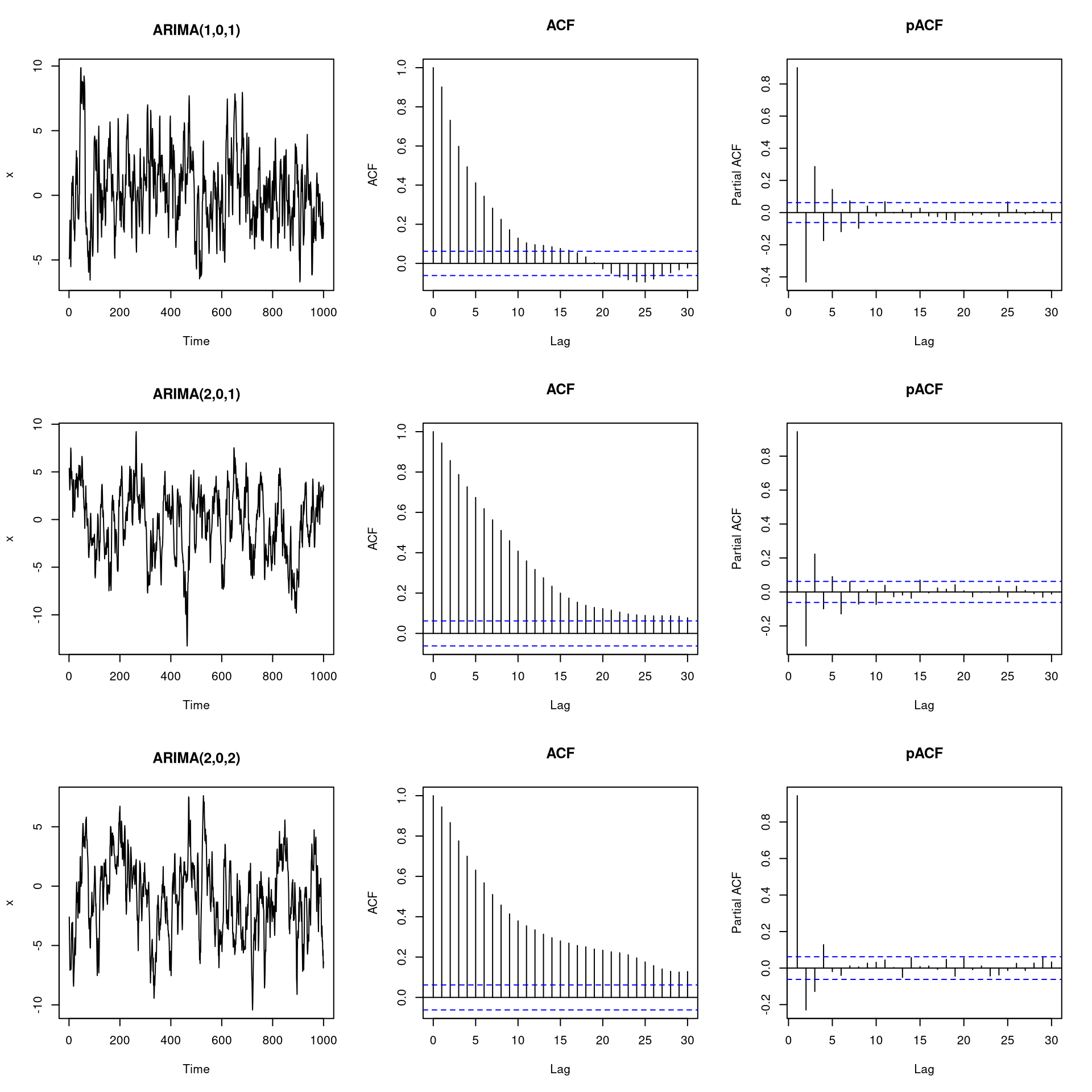
As we can see from the plots, it can be very challenging to derive suitable values for \(p\) and \(q\) based on visual inspection. Thus, it is often useful to apply a more quantitative approach for determining these parameters. In a few paragraphs, we will see how this can be done in practice by using the auto.arima function from the forecast package.
The SARIMA Model
To model seasonal trends, we need to expand the ARIMA model with the seasonal parameters \(P\), \(D\), and \(Q\), which correspond to \(p\), \(d\), and \(q\) in the original model:
- P: number of seasonal autoregressive (SAR) terms
- D: degree of seasonal differencing
- Q: number of seasonal moving average (SMA) terms
Accordingly, a seasonal ARIMA (SARIMA) model is denoted by ARIMA(p,d,q)\(\times\)(P,D,Q)\(_S\) where \(S\) is the period at which the seasonal trend occurs. For example, for \(S = 12\) there is a yearly trend, while for \(S = 3\) there is a quarterly trend. The additional parameters are included into the ARIMA model in the following way:
\[\Phi_P(B^S) \phi_P(B) (1 - B)^d (1 - B^S) y_t = \Theta_Q(B^S) \theta_q(B) \epsilon_t\,.\]
Here, \(\Phi_P\) and \(\Theta_Q\) are the coefficients for the seasonal AR and MA components, respectively.
The ARIMAX model
ARIMAX stands for *autoregressive integrated moving average with exogenous variables. An exogenous variable is a covariate, \(x_t\), that influence the observed time-series values, \(y_t\). ARIMAX can be specified by considering these \(r\) exogenous variables according to the coefficient vector \(\beta \in \mathbb{R}^r\):
\[\phi_p(B)(1 - B)^d y_t = \beta^T x_t \theta_q(B) \epsilon_t\,. \]
Here, \(x_t \in \mathbb{R}^r\) is the \(t\)-th vector of exogenous features.
Forecasting in R
Manually selecting all the parameters of an ARIMA model can be challenging. In R, you can automatically fit ARIMA models using the auto.arima function from the forecast package. This approach considers reasonable settings for \(p\), \(d\), and \(q\), as well as the seasonal parameters, \(P\), \(D\), and \(Q\). Note that you should set the parameters stepwise and approximation parameters to FALSE if you are dealing with a single data set to ensure that you obtain a well-fitting model.
SARIMA model for a stationary process
We will showcase the use of ARMA using the nino data from the tseries package, which gives sea-surface temperatures for the Nino Region 3.4 index. Let us verify that the data are stationary:
plot(nino3.4)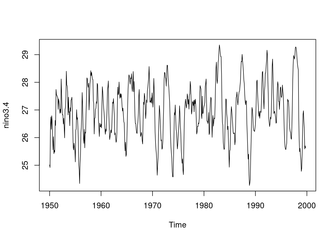
Since the data is stationary, we can set \(d = 0\).
To verify whether there is any seasonal trend, we will decompose the data:
nino.components <- decompose(nino3.4)
plot(nino.components)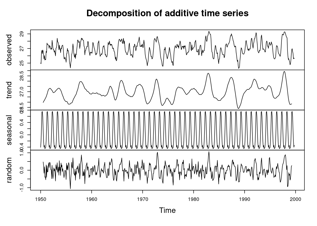
There is no overall trend, which is typical for a stationary process. However, there is a strong seasonal component to the data. Thus, we definitely want to include parameters modeling the seasonal effects.
Seasonal model
For the seasonal model, we need to specify additional parameters parameters \((P, D, Q)_S\). Since the seasonal trend does not dominate the time-series data, we will set \(D = 0\). Additionally, because the seasonal trend in the nino data is a yearly trend, we can se \(S = 12\) months. To determine the other parameters for the seasonal model, let us consider the plots for the seasonal component:
nino.season <- nino.components$seasonal
acf(nino.season, type = "partial")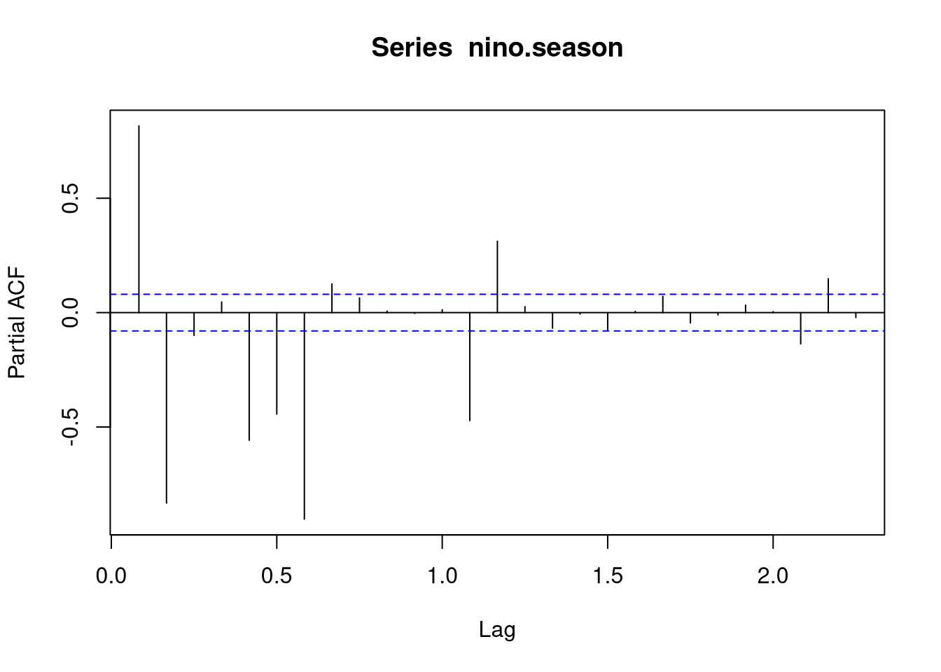
We will use an AR term of order 2 for the seasonal component, that is, we set \(P = 2\) and \(Q = 0\). Thus, the seasonal model is specified by (2,0,0).
Non-seasonal model
For the non-seasonal model, we still need to find \(p\) and \(q\). For this purpose, we will plot the ACF and pACF to identify the values for the AR and MA parameters:
par(mfrow = c(1,2))
acfp <- acf(nino3.4, main = "pACF", plot = FALSE)
# transform lag from years to months
acfp$lag <- acfp$lag * 12
plot(acfp, main = "ACF")
acfpl <- acf(nino3.4, main = "pACF", type = "partial", plot = FALSE)
# transform lag from years to months
acfpl$lag <- acfpl$lag * 12
plot(acfpl, main = "pACF")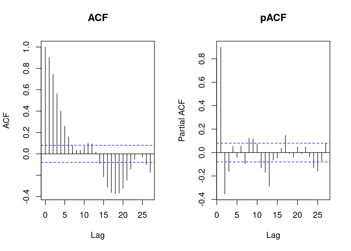
We will set the AR order to \(2\) and and the MA order to \(1\). This gives the final model: \((2,0,1)x(2,0,0)_{12}\).
We can fit the model using the Arima function from the forecast package.
library(forecast)
# non-seasonal model: (p,d,q)
order.non.seasonal <- c(2,0,1)
# seasonal model: (P,D,Q)
order.seasonal <- c(2,0,0)
A <- Arima(nino3.4, order = order.non.seasonal,
            seasonal = order.seasonal)
We can now use the model to forecast how the temperatures in the Nino 3.4 region will change in the future. There are two ways to obtain predictions from a forecasting model. The first approach relies on the predict function, while the second approach uses the forecast function from the forecast package. Using the predict function, we can forecast and visualize the results in the following way:
# to construct a custom plot, we can use the predict function:
forecast <- predict(A, n.ahead = 60) # predict 5 years into the future
library(ggplot2)
plot.df <- rbind(cbind(fortify(nino3.4), sd = 0), cbind(fortify(forecast$pred), sd = as.numeric(forecast$se)))
plot.df$upper <- plot.df$y + plot.df$sd * 1.96
plot.df$lower <- plot.df$y - plot.df$sd * 1.96
ggplot(plot.df, aes(x = x ,y = y)) +
        geom_line() + geom_ribbon(aes(ymin = lower, ymax = upper), alpha = 0.2) +
        ylab("Temperature") + xlab("Year")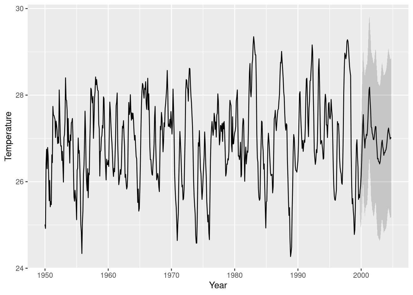
If we do not require a custom plot, we can obtain the predictions and corresponding visualization more easily, by using the forecast function:
# use the forecast function to use the built-in plotting function:
forecast <- forecast(A, h = 60) # predict 5 years into the future
plot(forecast)
ARIMA model for non-stationary data
To demonstrate the use of an ARIMA model for non-stationary data, we will use the gtemp data set from the astsa package. The data set provides yearly measurements of global mean land-ocean temperature deviations.
library(astsa)
data(gtemp)
plot(gtemp)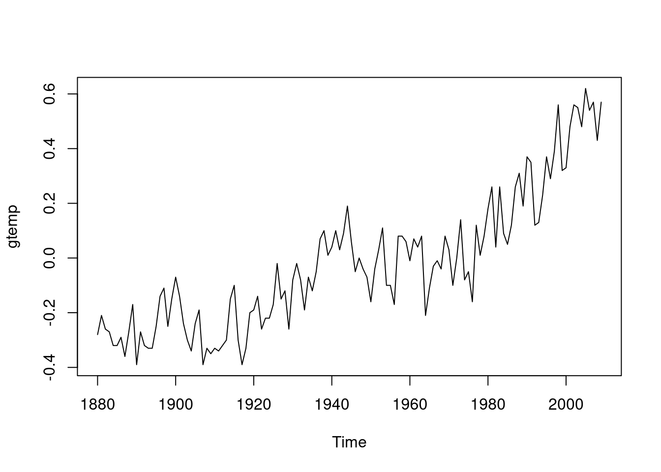
As you can see, the values are increasing over time. Thus, it is necessary to difference the data. To make the data stationary, we will use \(d = 1\):
plot(diff(gtemp))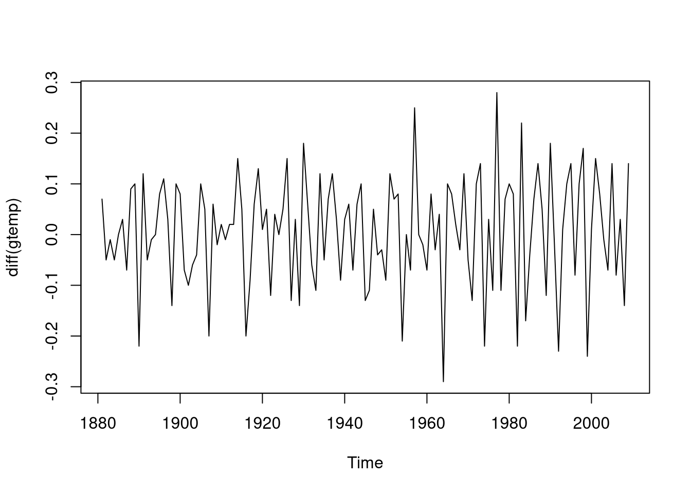
Now, the data seems to be stationary.
Since a single measurement was taken per year, it is not possible to identify any seasonal characteristics. Thus, we do not need a seasonal model for this data set. To identify \(p\) and \(q\), we consider the ACF and pACF plots:
par(mfrow = c(1,2))
acf(diff(gtemp), main = "ACF")
acf(diff(gtemp), main = "pACF", type = "partial")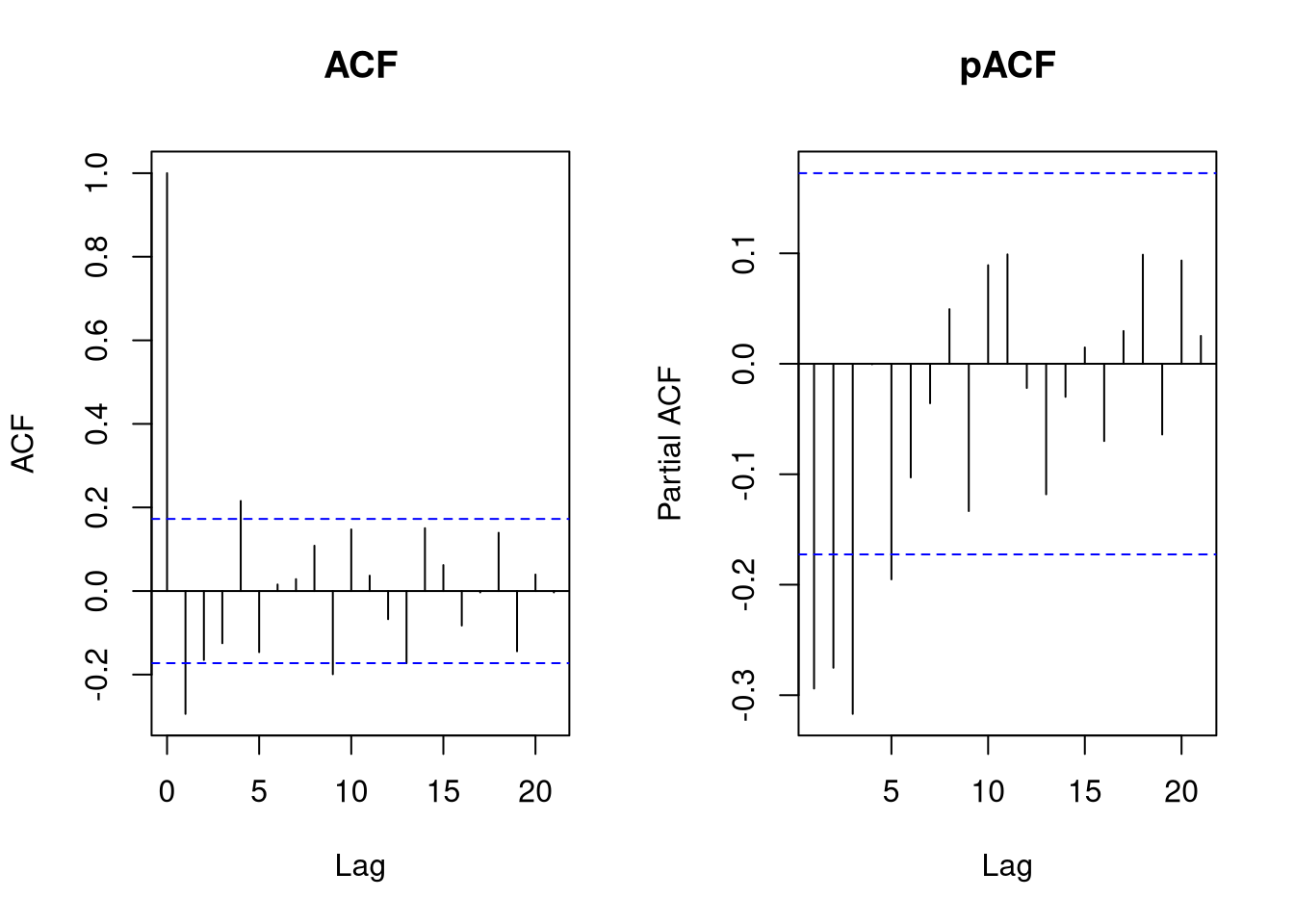
Since the first lag’s autocorrelation is negative, we will use a moving average model. Thus, we set \(p = 0\) and \(q = 1\), which leads to an ARIMA(0,1,1) model. Since the data are subject to increasing values, we will include a drift term in the model to take this effect into account:
A <- Arima(gtemp, order = c(0,1,1), include.drift = TRUE)We can now forecast how the mean land-ocean temperature deviation will change in the next years:
forecast <- forecast(A, h = 30) # predict 30 years into the future
plot(forecast)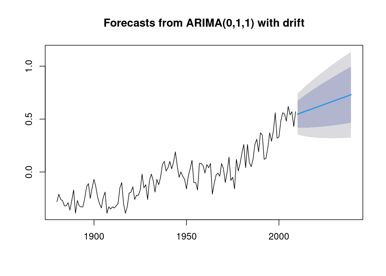
The model suggests that the mean land-ocean temperature deviation will further increase in the next years.
ARIMAX on the airquality data set
To showcase the use of an ARIMAX model, we will use ozone data set, which I had investigated previously.
Let us load the ozone data set and divide it into test and training set. Note that we have ensured that training and test data consist of consecutive temporal measurements.
data(airquality)
ozone <- subset(na.omit(airquality))
set.seed(123)
N.train <- ceiling(0.7 * nrow(ozone))
N.test <- nrow(ozone) - N.train
# ensure to take only subsequent measurements for time-series analysis:
trainset <- seq_len(nrow(ozone))[1:N.train]
testset <- setdiff(seq_len(nrow(ozone)), trainset)
Since the data set does not indicate the relative point in time, we will manually create such an annotation:
For this purpose, we will create a new column in the ozone data set, which reflects the relative point in time:
# create a time-series object
year <- 1973 # known from data documentation
dates <- as.Date(paste0(year, "-", ozone$Month, "-", ozone$Day))
min.date <- as.numeric(format(min(dates), "%j"))
max.date <- as.numeric(format(max(dates), "%j"))
ozone.ts <- ts(ozone$Ozone, start = min.date, end = max.date, frequency = 1)
ozone.ts <- window(ozone.ts, 121, 231) # deal with repetition due to missing time values
ozone$t <- seq(start(ozone.ts)[1], end(ozone.ts)[1]) # assumes that measurements are consecutive although they are not
Now that we have a temporal dimension, we can plot the longitudinal behavior of the ozone level:
library(ggplot2)
ggplot(ozone, aes(x = t, y = Ozone)) + geom_line() +
        geom_point()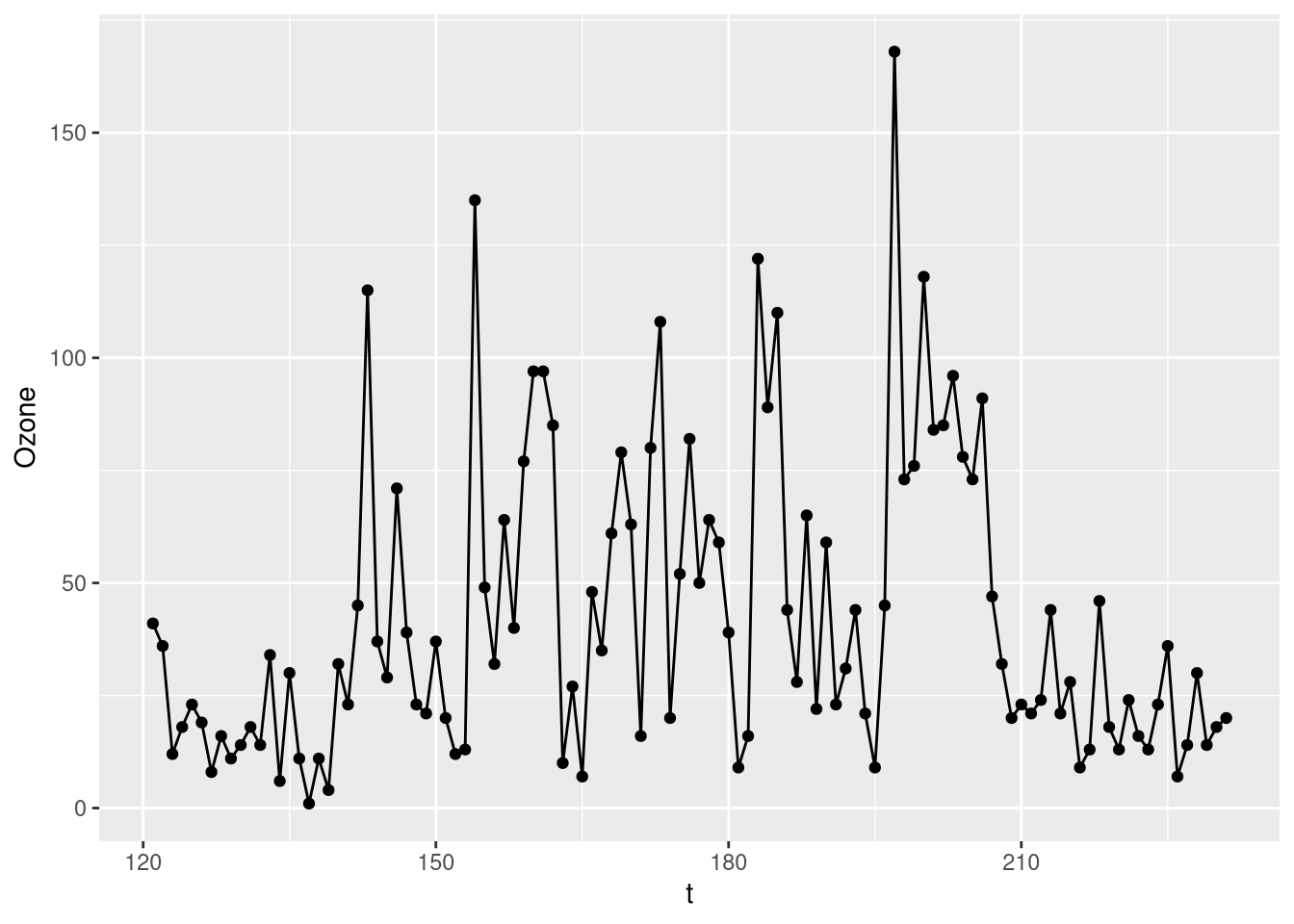
The time-series data seem to be stationary. Let us consider the ACF and pACF plots to see which AR and MA terms we should consider
par(mfrow = c(1,2))
acf(ozone.ts)
acf(ozone.ts, type = "partial")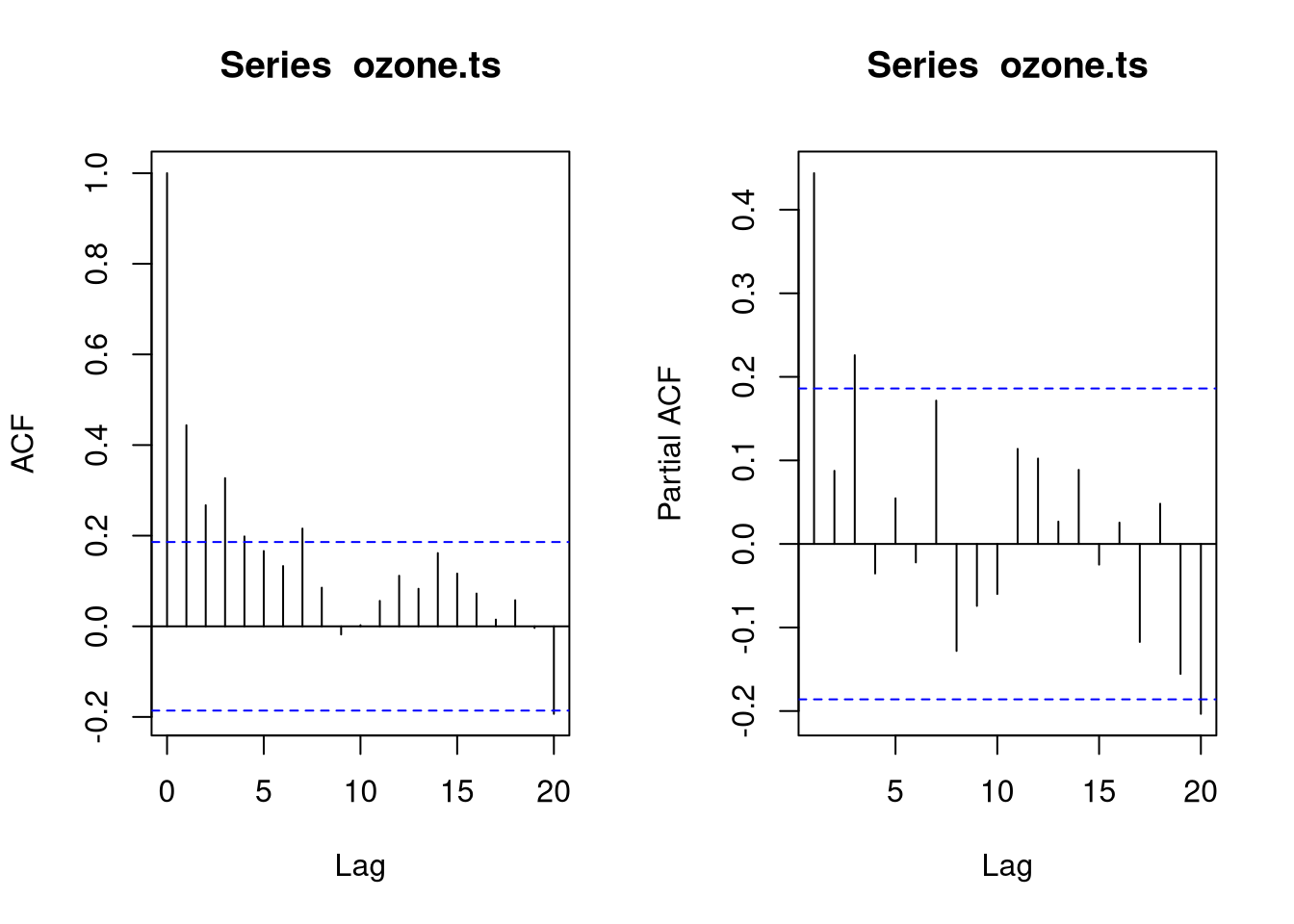
The autocorrelation plots are very unclear, suggesting that there is actually no time trend in the data. Thus, we would opt for an ARIMA(0,0,0) model. Since an ARIMAX model with the parameters (0,0,0) does not have a benefit over a conventional linear regression model, we can conclude that the temporal trend in the ozone data is not sufficient to improve the prediction of ozone levels. Let us verify this:
# ARIMAX(0,0,0) model
library(TSA) # warning: not available via CRAN any more
features <- c("Solar.R", "Wind", "Temp") # exogenous features
A <- arimax(x = ozone$Ozone[trainset],
       xreg = ozone[trainset,features],
        order = c(0,0,0))
preds.temporal <- predict(A, newxreg = ozone[testset, features])
# Previously developed weighted negative binomial model
library(MASS)
get.weights <- function(ozone) {
    z.scores <- (ozone$Ozone - mean(ozone$Ozone)) / sd(ozone$Ozone)
    weights <- exp(z.scores)
    weights <- weights / mean(weights) # normalize to mean 1
    return(weights)
}
weights <- get.weights(ozone)
# train weighted negative binomial model
model.nb <- glm.nb(Ozone ~ Solar.R + Temp + Wind, data = ozone, subset = trainset, weights = weights)
preds.nb <- predict(model.nb, newdata = ozone[testset,], type = "response")
# Performance:
Rsquared.linear <- cor(preds.nb, ozone[testset, "Ozone"])^2
Rsquared.temporal <- cor(preds.temporal$pred, ozone[testset, "Ozone"])^2
print(Rsquared.linear)
print(Rsquared.temporal)
Note that the TSA package is not available from CRAN anymore because it has been orphaned (2020-07).
ARIMAX on the airquality data set
To demonstrate an ARIMAX model on a better suited set of data, let us load the Icecream data set from the Ecdat package:
library(Ecdat)
data(Icecream)
The Icecream data set contains the following variables:
- cons: The ice cream consumption in pints per capita.
- income:: The average weekly family income in USD.
- price: The price of ice cream per pint.
- temp: The average temperature in Fahrenheit.
The measurements are four-weekly observations from 1951-03-18 to 1953-07-11.
We will model cons, the ice cream consumption as a time series and use income, price, and average as exogenous variables. Before beginning to model, we will create a time-series object from the data frame.
# create a time-series object
library(lubridate) # for week function
wk <- week(c(as.Date("1951-03-18"), as.Date("1953-07-11")))
months <- c(seq(3,12), seq(1,12), seq(1,7))
wks <- c(seq(wk[1], 52, 4), seq(1, 52, 4), seq(1, 52, 4))
ice.ts <- ts(Icecream$cons, start = c(1951, 3), end = c(1953, 6), frequency = 52/4)
Let us investigate the data now:
plot(decompose(ice.ts))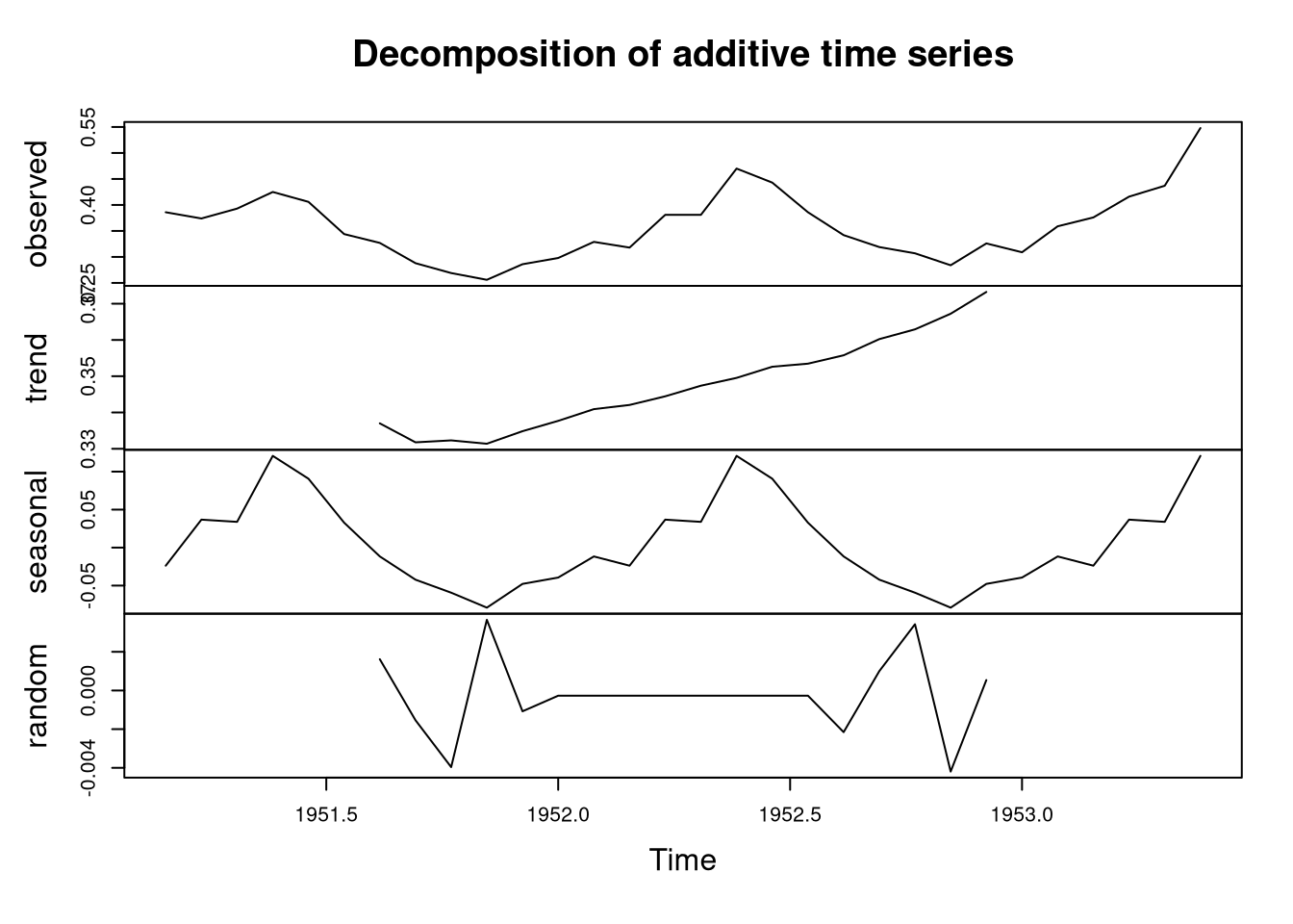
So, there are two trends in the data:
- Overall, ice cream consumption has increased considerably between 1951 and 1953.
- Ice cream sales are peaking in the summer.
We will now investigate ACF and pACF to choose \(p\) and \(q\):
par(mfrow = c(1,2))
acf(ice.ts)
acf(ice.ts, type = "partial")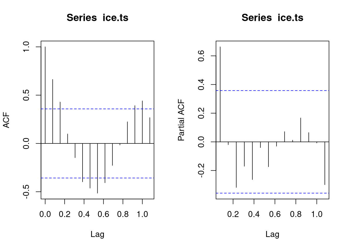
Due to the seasonal trend, we would probably fit an ARIMA(1,0,0)(1,0,0) model. However, since we know the temperature and the income from exogenous variables, they can probably explain the trends of the data:
plot(Icecream$income) # explains the overall trend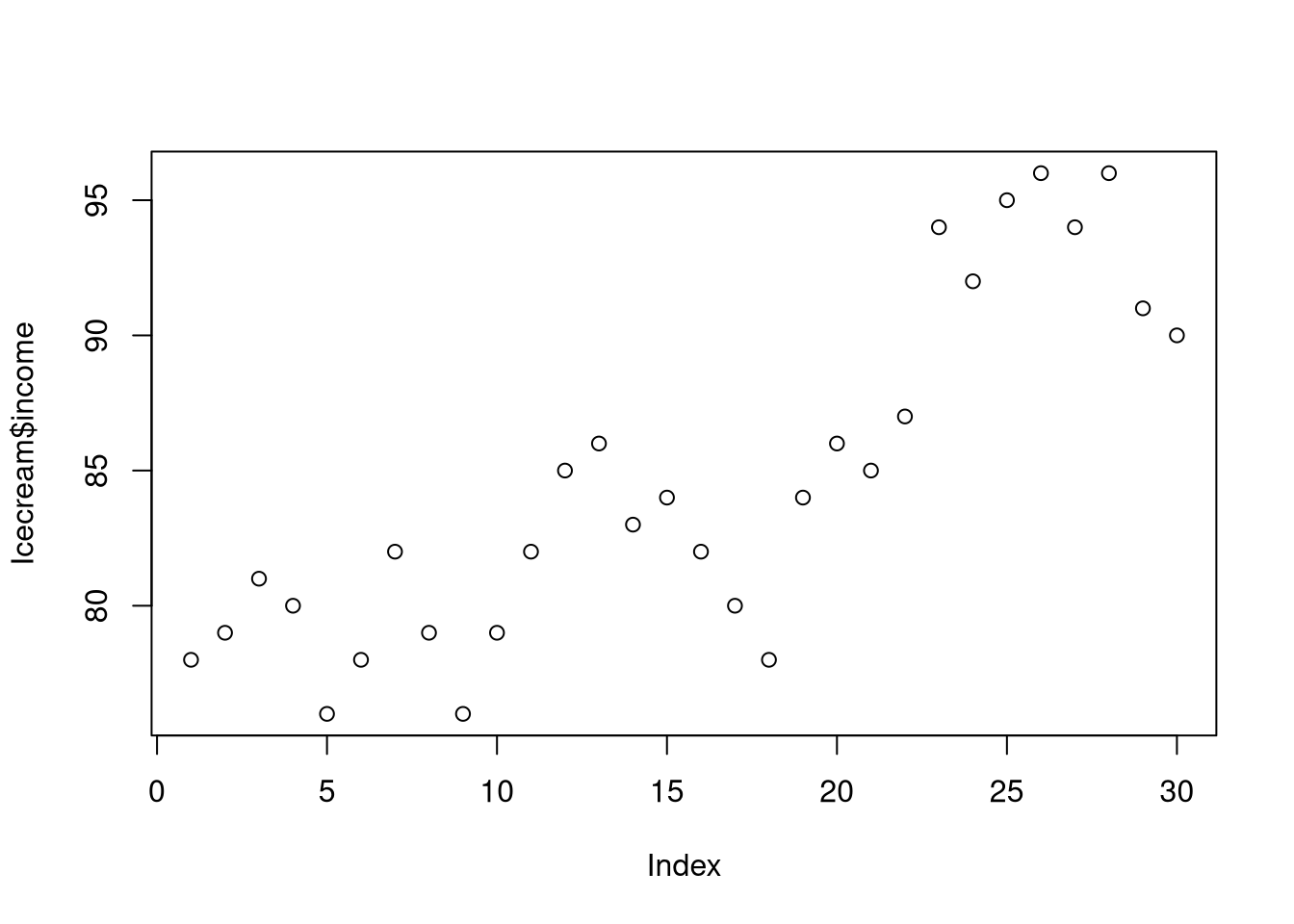
plot(Icecream$temp) # explains the seasonal trend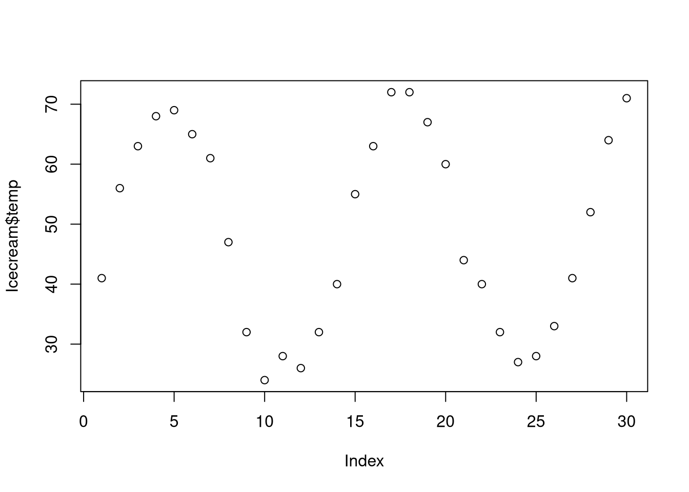
Since income explains the overall trend, we do not need a drift term. Furthermore, since temp explains the seasonal trend, we do not need a seasonal model. Thus, we should use an ARIMAX(1,0,0) model for forecasting. To investigate whether these assumptions are true, we will compare the ARIMAX(1,0,0) model with an ARIMA(1,0,0)(1,0,0) model using the following code
train <- 1:20
test <- 21:30
test.matrix = as.matrix(Icecream[train, c("income", "temp")])
A <- Arima(window(ice.ts, c(1951,3), c(1951, 3 + (20-1))),
        xreg = test.matrix,
        order = c(1,0,0))
preds <- forecast(A, xreg = test.matrix)
plot(preds)
lines(window(ice.ts, c(1951, 22), c(1951, 30))) # actual values in black
# contrast ARIMAX with ARIMA
A.season <- Arima(window(ice.ts, c(1951,3), c(1951, 3 + (20-1))),
        order = c(1,0,0),
        season = c(1,0,0))
preds <- forecast(A.season, h = 24)
lines(x = as.numeric(rownames(as.data.frame(preds))), y = as.data.frame(preds)[,2], lty = 2)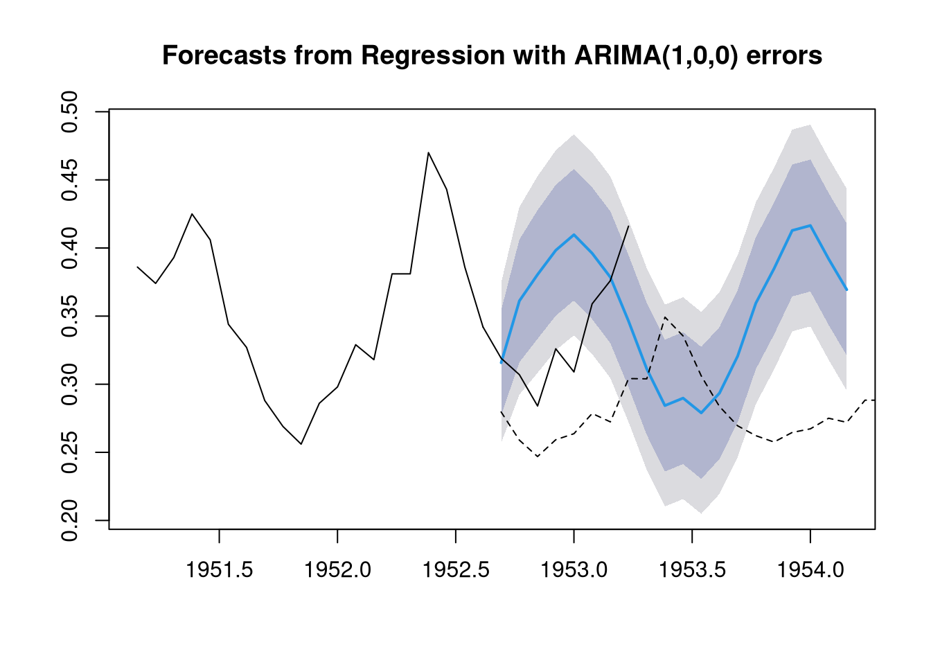
The forecast of the ARIMAX(1,0,0) model is shown in blue, while the forecast of the ARIMA(1,0,0)(1,0,0) model is shown as a dashed line. The actual observed values are shown as a black line. The results suggest that the ARIMAX(1,0,0) is decidedly more accurate than the ARIMA(1,0,0)(1,0,0) model.
Note, however, that the ARIMAX model is, to some extent, not as useful for the purpose of forecasting as a pure ARIMA model. This is because, the ARIMAX model requires exogenous measurements for any new data point it is supposed to forecast. For example, for the ice cream data set, we do not have exogenous data that extends beyond 1953-07-11. Thus, we cannot forecast beyond this point in time using the ARIMAX model, while this is possible with the ARIMA model:
preds <- forecast(A.season, h = 60)
plot(preds)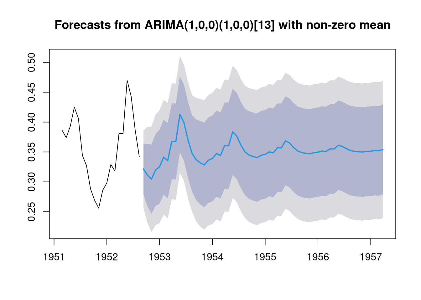
References
If you would like to read more about forecasting and the use of ARIMA models, you may want to consider the following resources:


Comments
There aren't any comments yet. Be the first to comment!